Hanlon is a Canadian Designer based in Vancouver, specializing in Graphic Design, Illustration, Motion Design, and Web Design and Development. Previously the Creative Director and Graphic Designer at Farmwork to Feed Canada and Senior Graphic Designer at the Vancouver Asian Film Festival. Currently, he works full-time at VetCare Canada as a Graphic and Web Designer. He is always looking to take on a new challenge.
As a strategic visual problem solver, I approach designs with an endless curiosity and passion for the craft. Wired for collaboration, I work with my teammates and clients to develop outstanding designs. Delivering cohesive strategies for digital media development is where I thrive, and my enthusiasm for teamwork and communication allows me to bring out the best in my colleagues. Good design is about simplifying a world of possibilities!
Get in Touch:
hanlonwu13@gmail.com
778.697.1610
Graphic and Web Designer - VetCare Canada
Creative Director and Graphic Designer - Farmwork to Feed Canada
Senior Graphic Designer - Vancouver Asian Film Festival
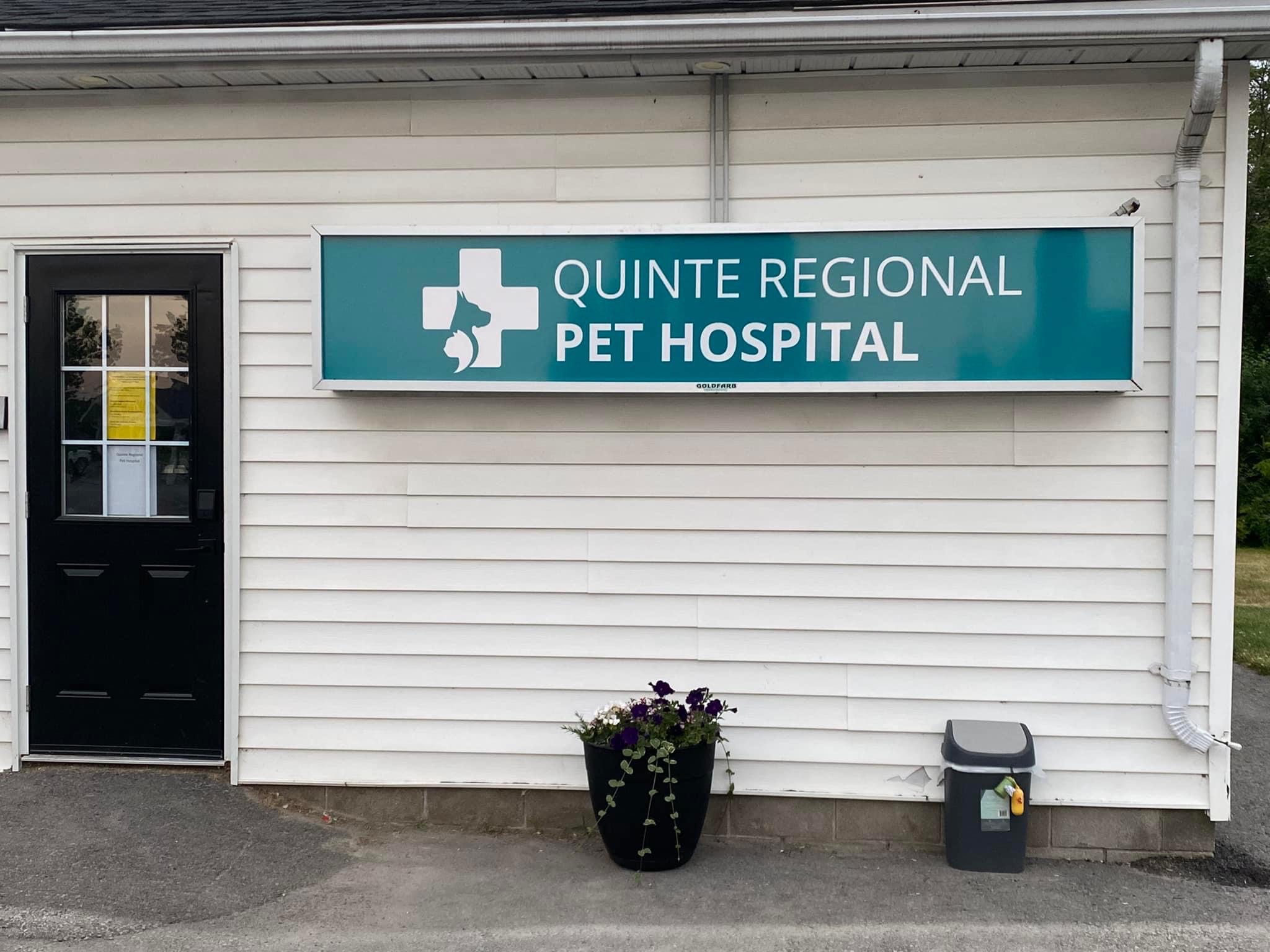
Working for Vetcare has been a very rewarding experience and has taught me much about being a professional designer in a corporate environment. In my current role, I am responsible for graphic design for over 40 veterinary clinics; including website design, branding identity development & logo design, advertisements, social media and environmental design such as signage and window overlays. I am also using my technical expertise in coding to help with web development, IT services and domain management. Each clinic has its own unique needs and customizations when it comes to design, and each has its own market in which it is trying to sell their services. Customizing my work to their needs is a necessary part of my job and I enjoy every moment of it.
One of my main responsibilities at VetCare is to help develop the brand identity of these clinics. I work with them to create a logo and brand system that not only fits the personality of the clinic but will also sell well to their local market. Though most clinics are happy with something with pets in their logo, I look to design a better logo that suits them perfectly.
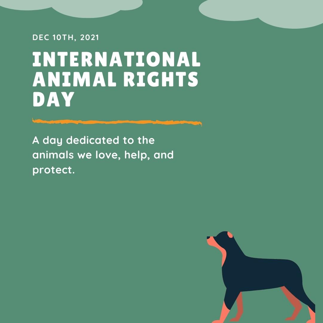
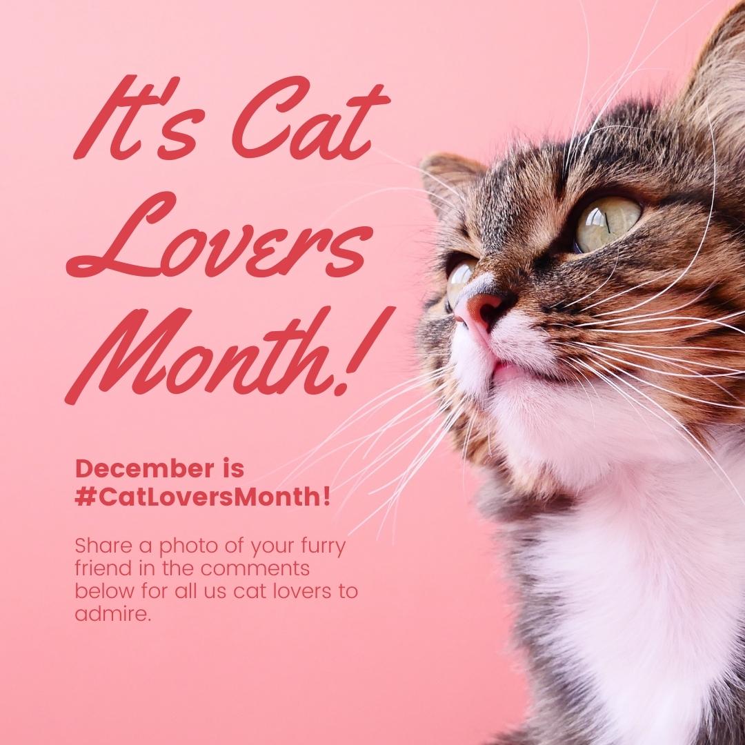
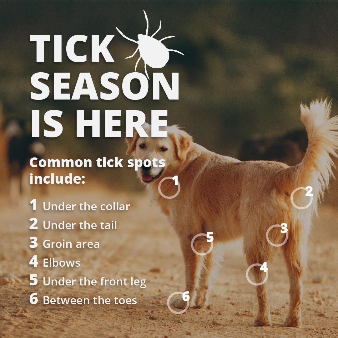
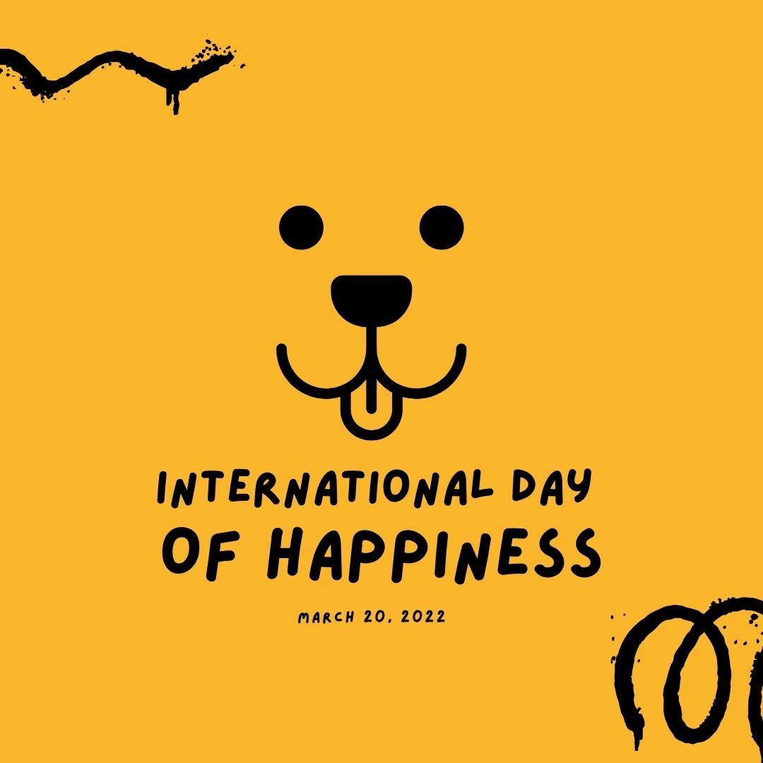
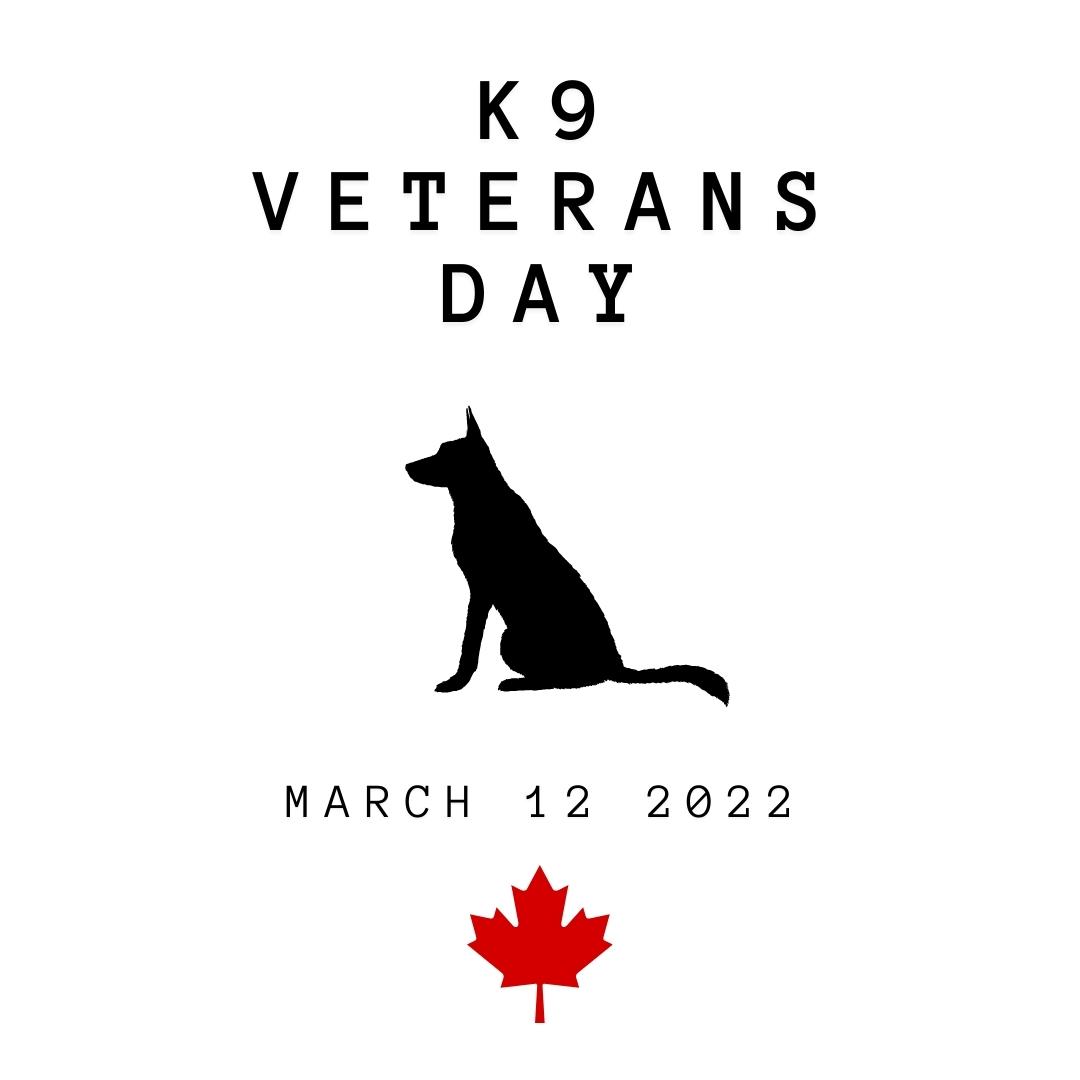
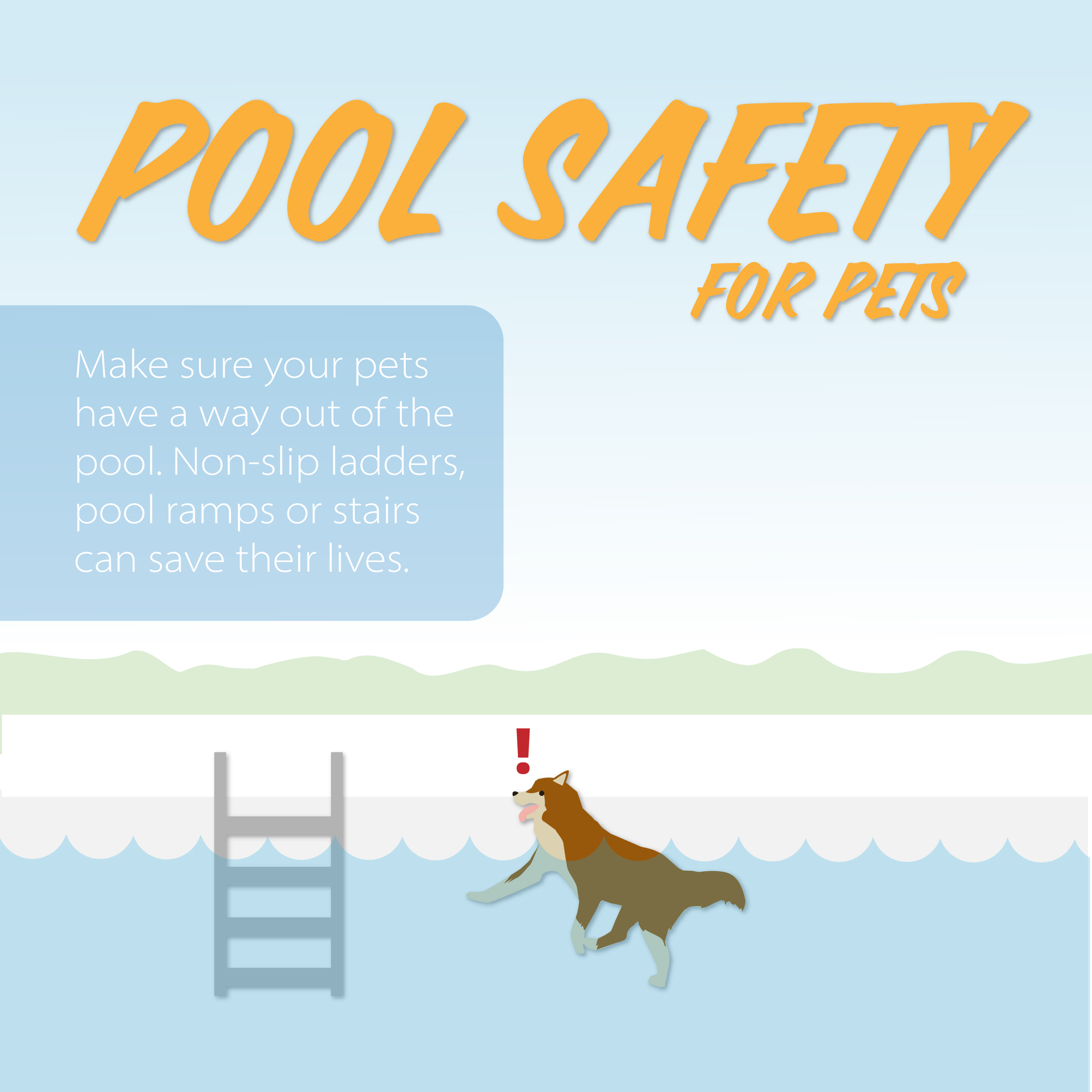
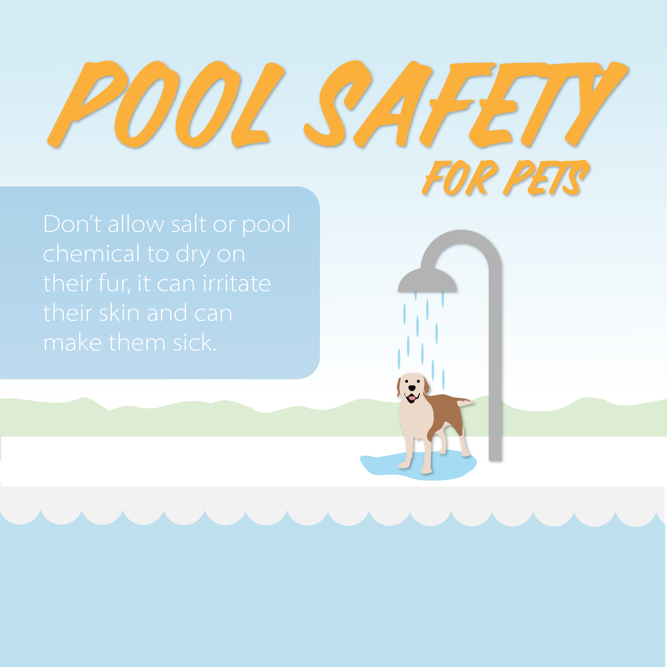
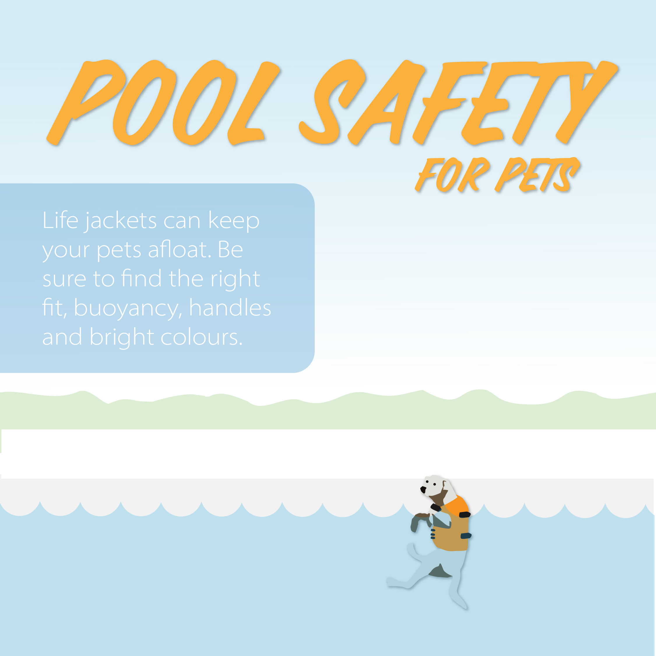
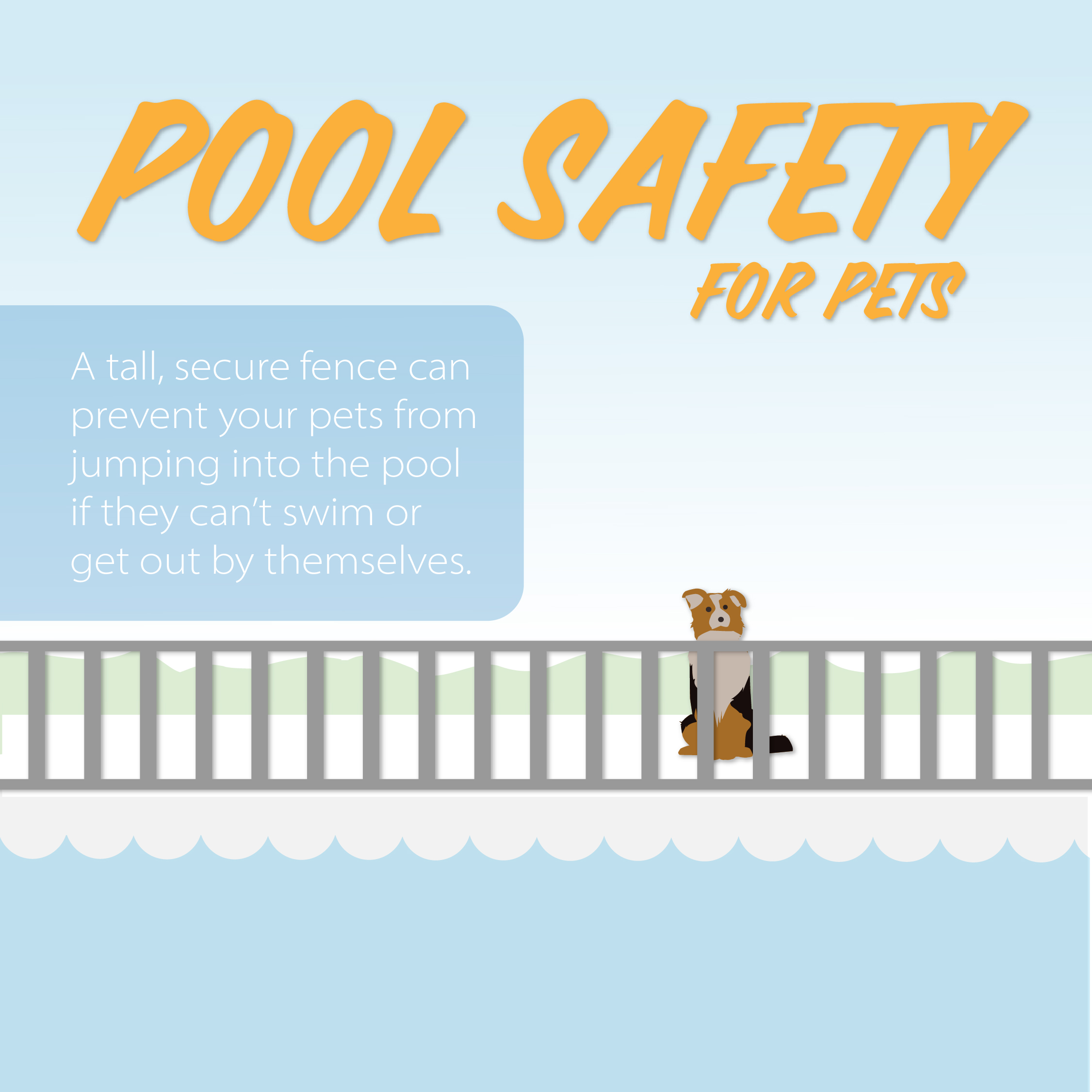
Taking veterinary design social.
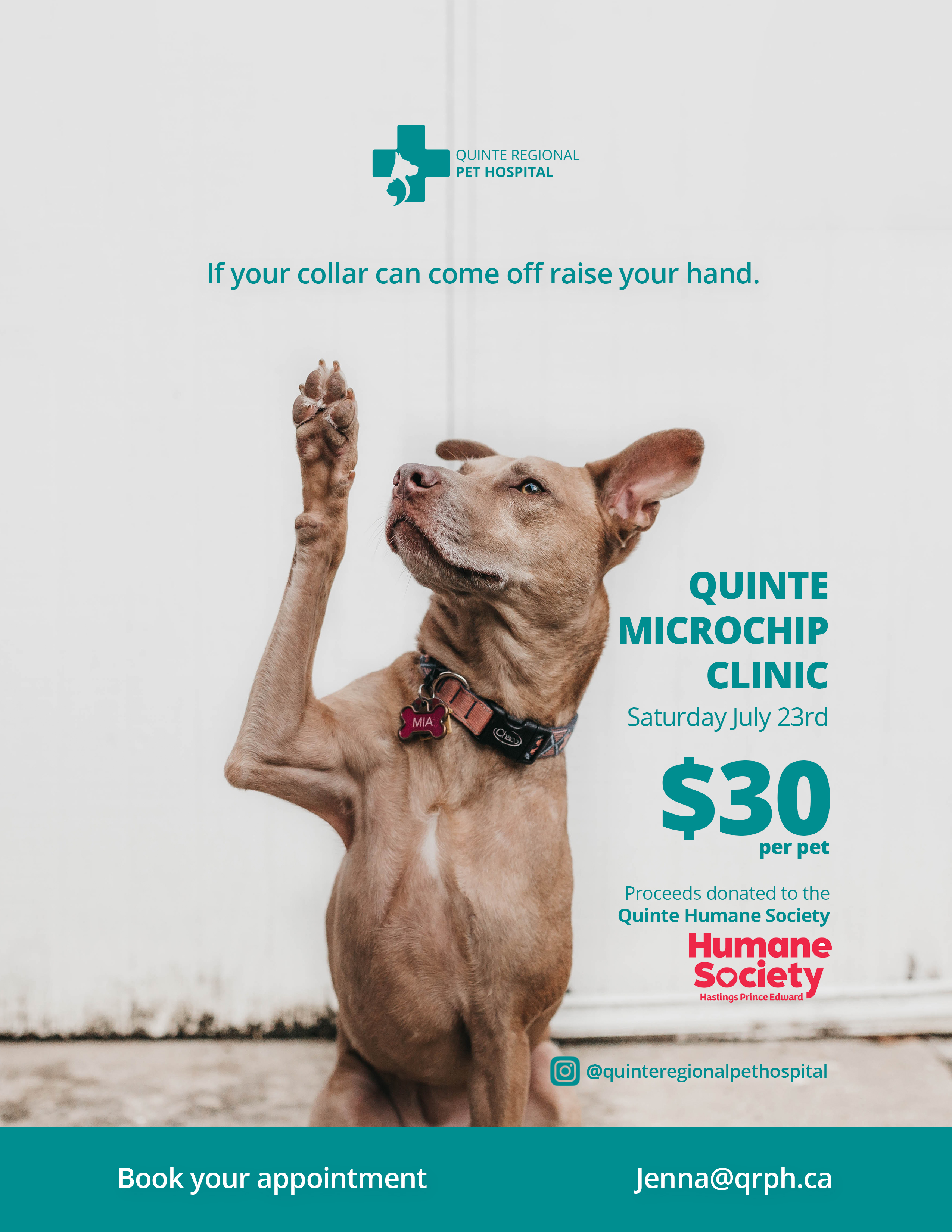
I have the pleasure of working on a variety of different projects for our veterinary clinics. Here are a few.
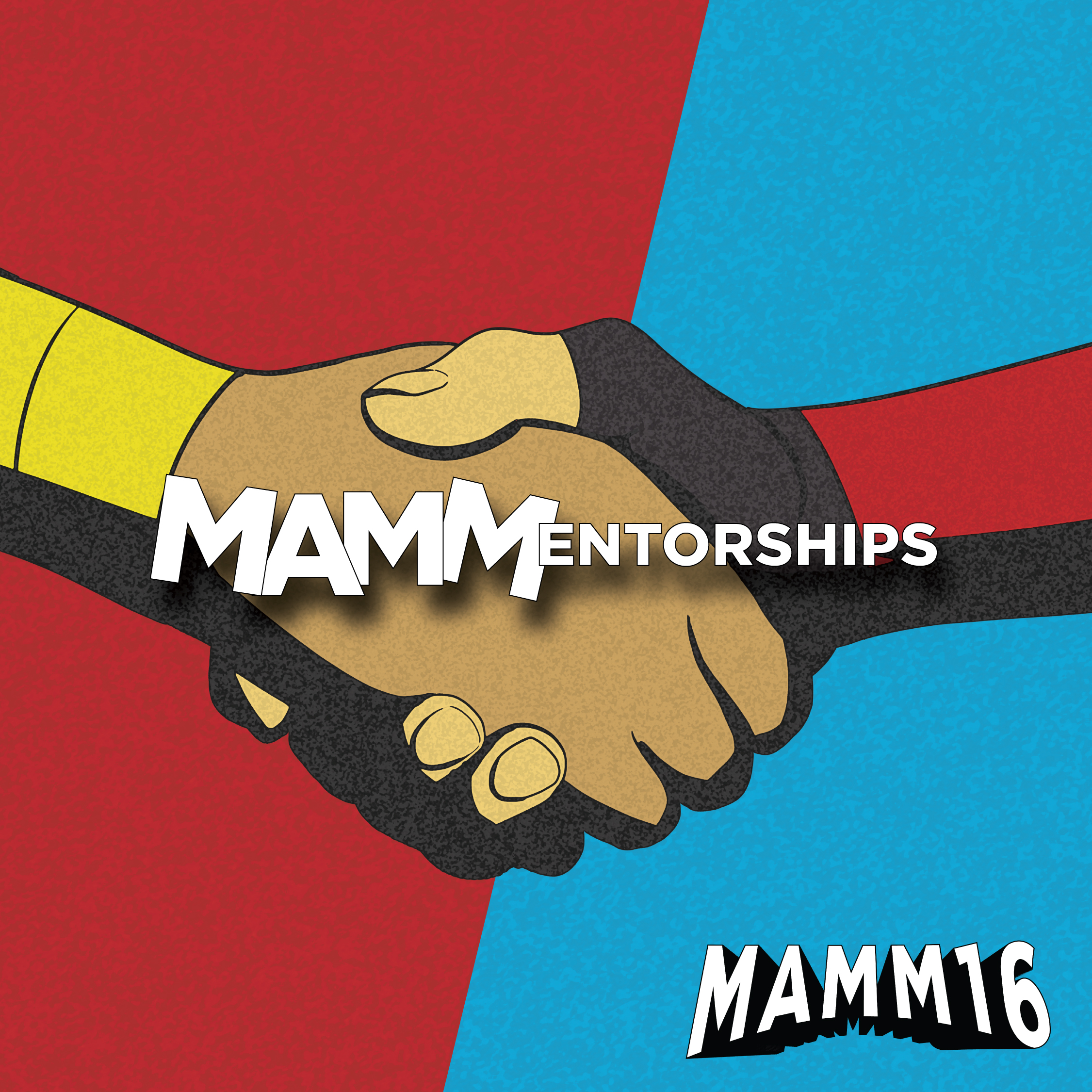
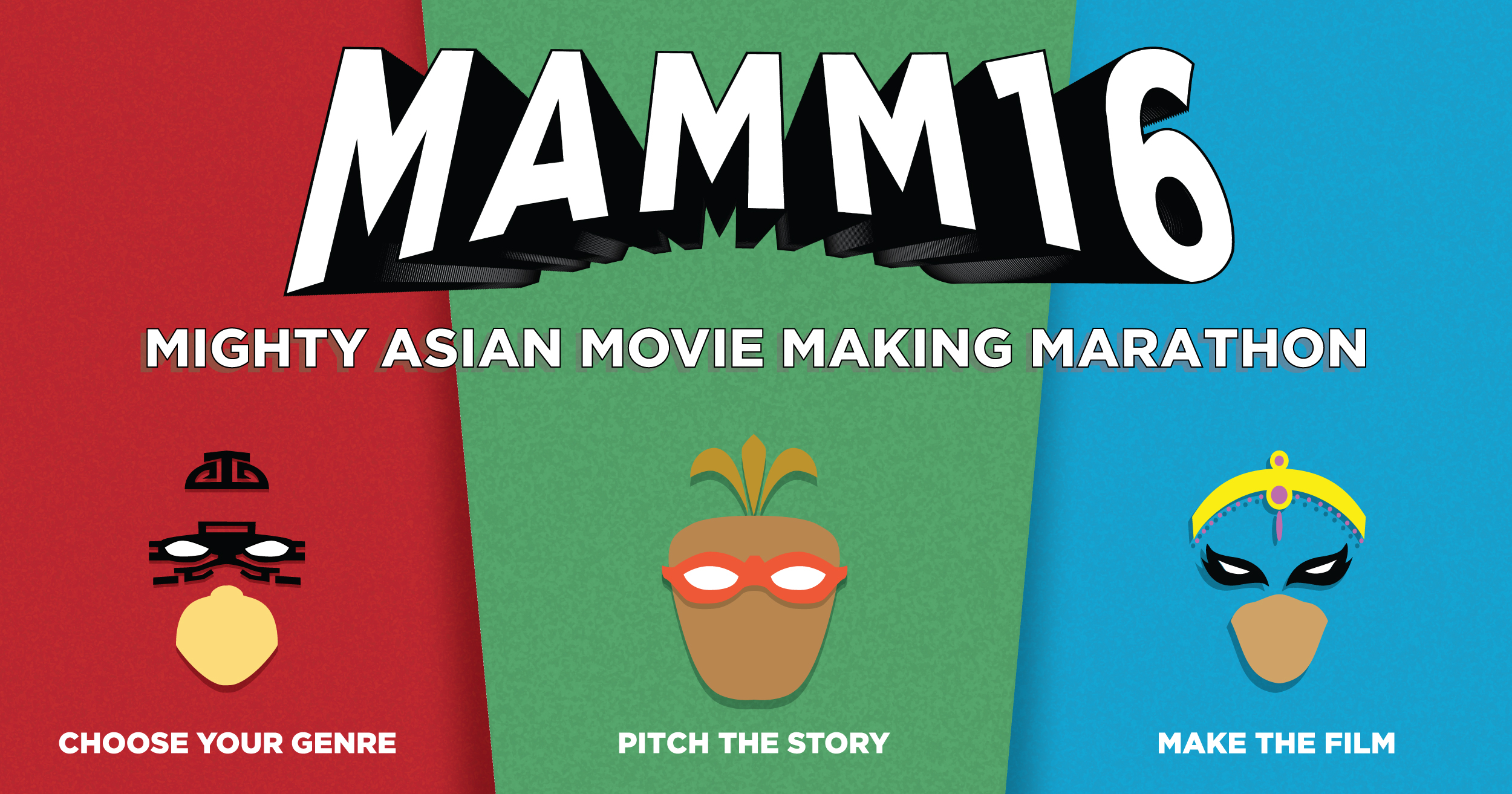
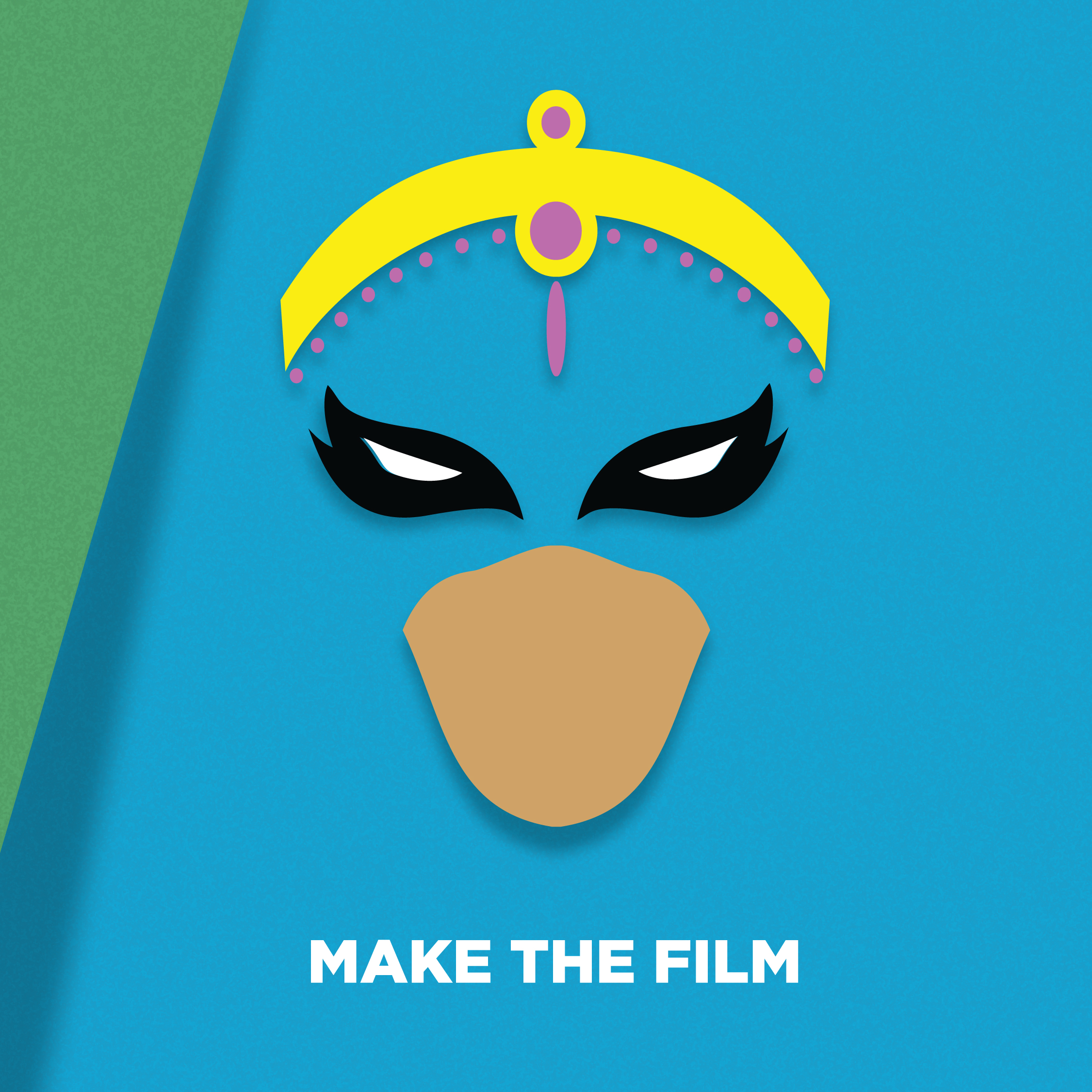
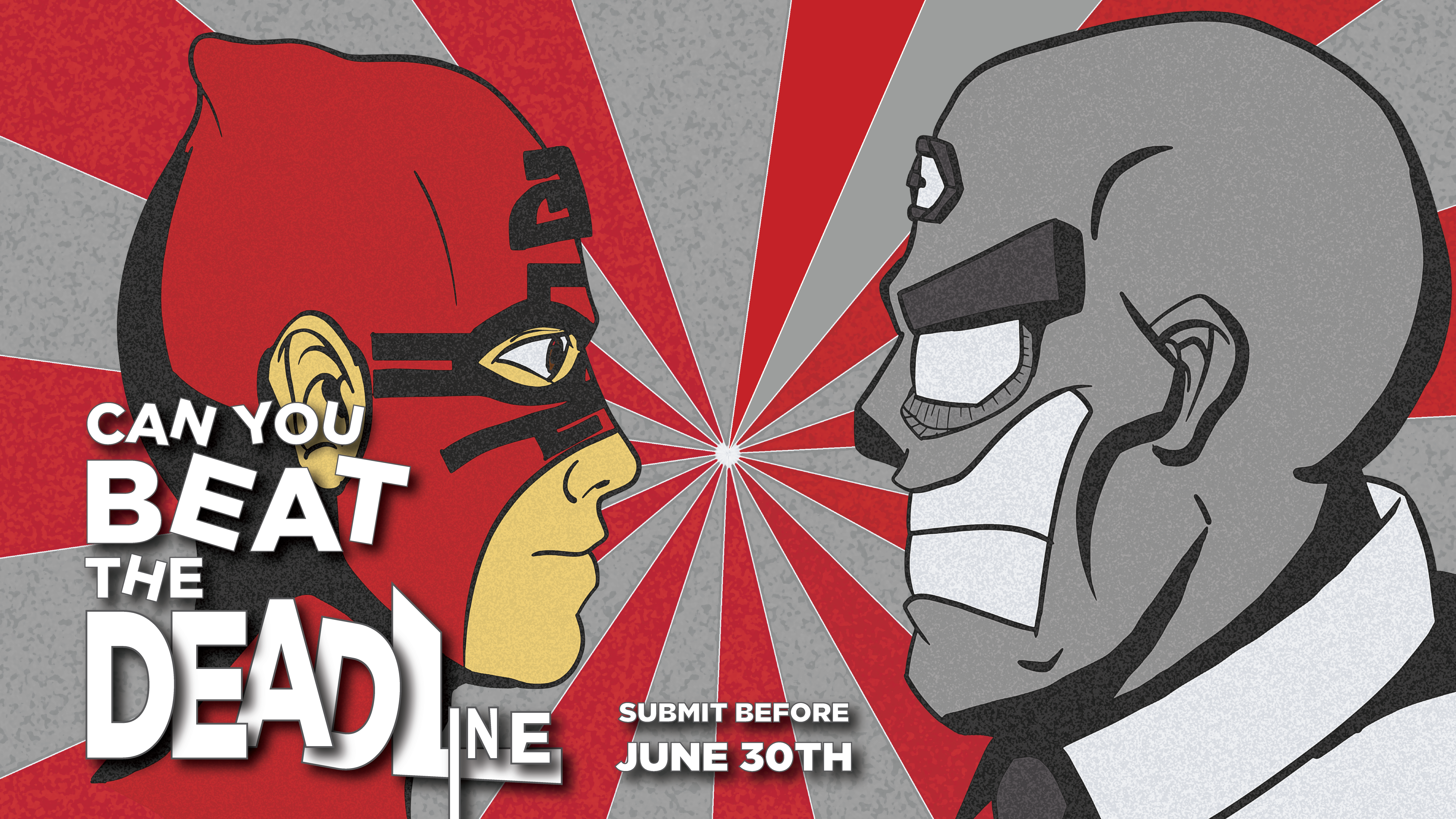
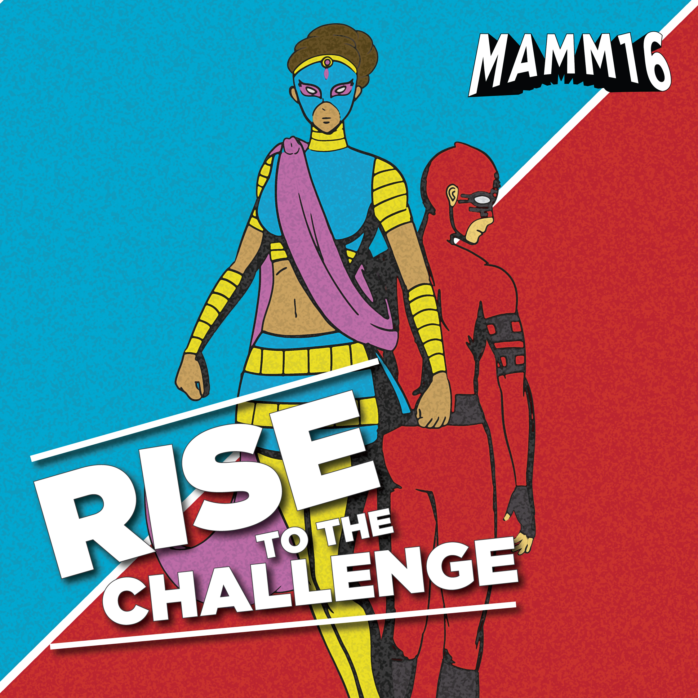
Volunteering for MAMM is one of the most exciting projects that I have been involved in. MAMM is the Mighty Asian Movie Making Marathon - a part of the Vancouver Asian Film Festival. Hired as their Lead Designer and Art Director, I decided to evolve their already established superhero motif into something greater - fully developing the characters and providing a storyline to create a real story telling experience through social media. The campaign was a great success and one of their best years. We even hired a videographer to create a cheesy short film for the story.
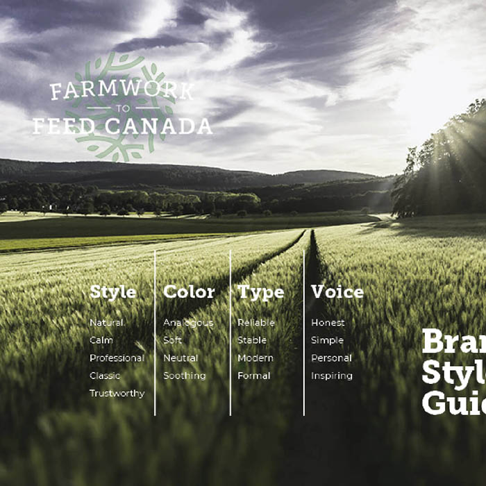
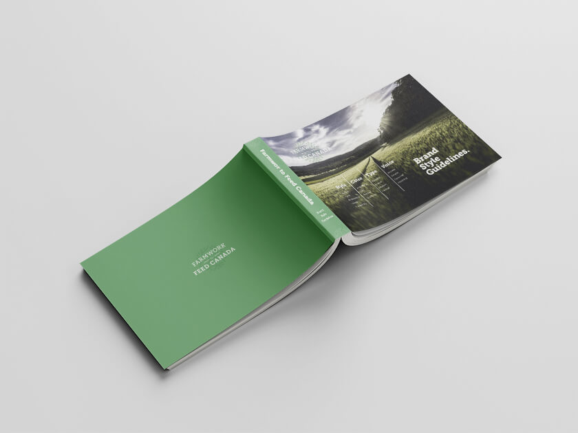
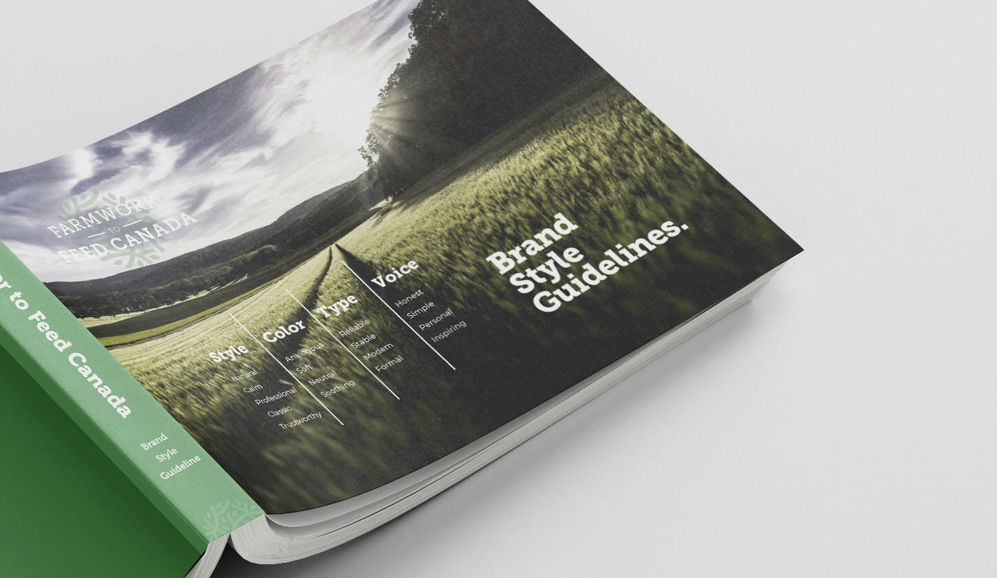
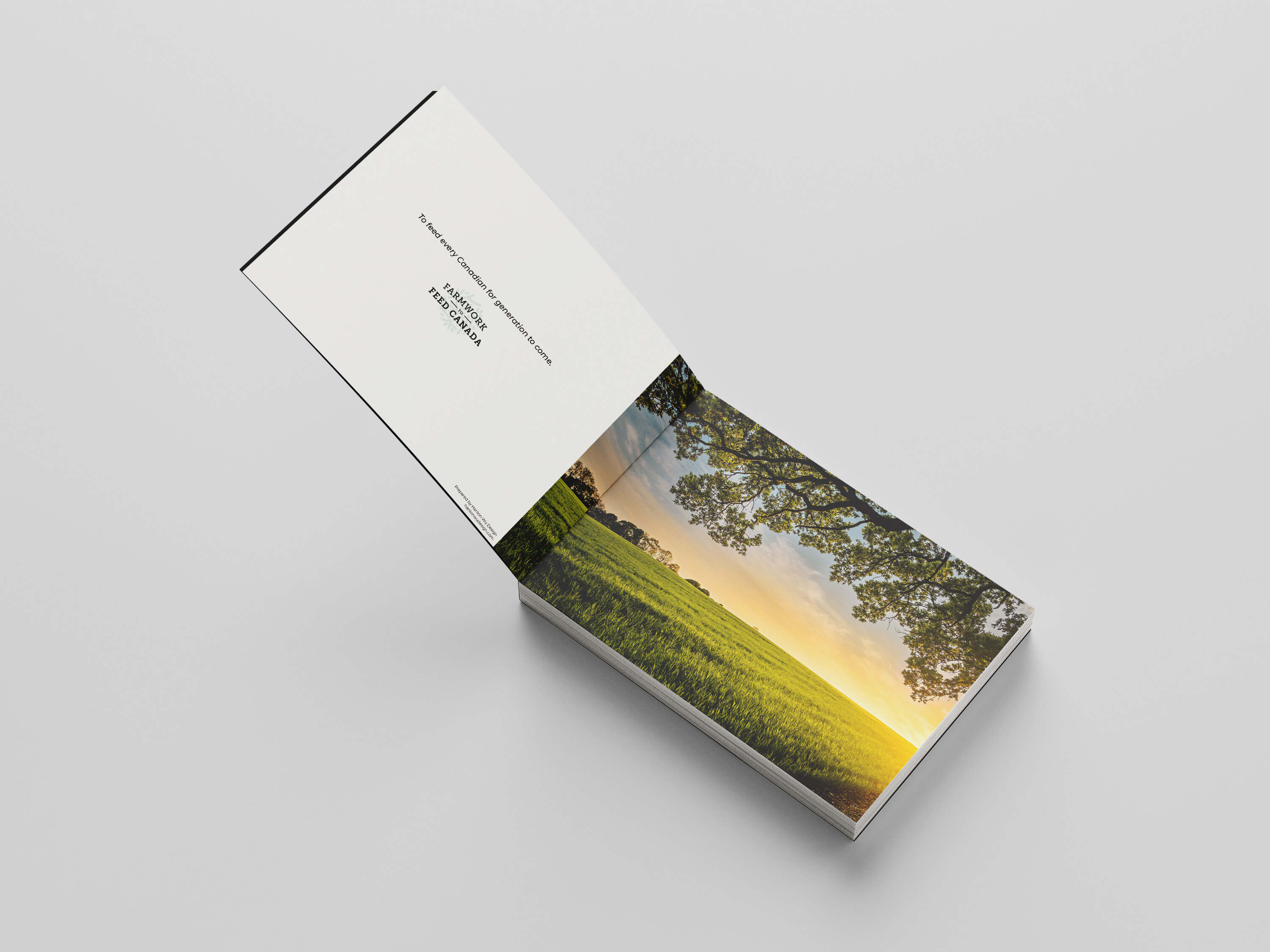
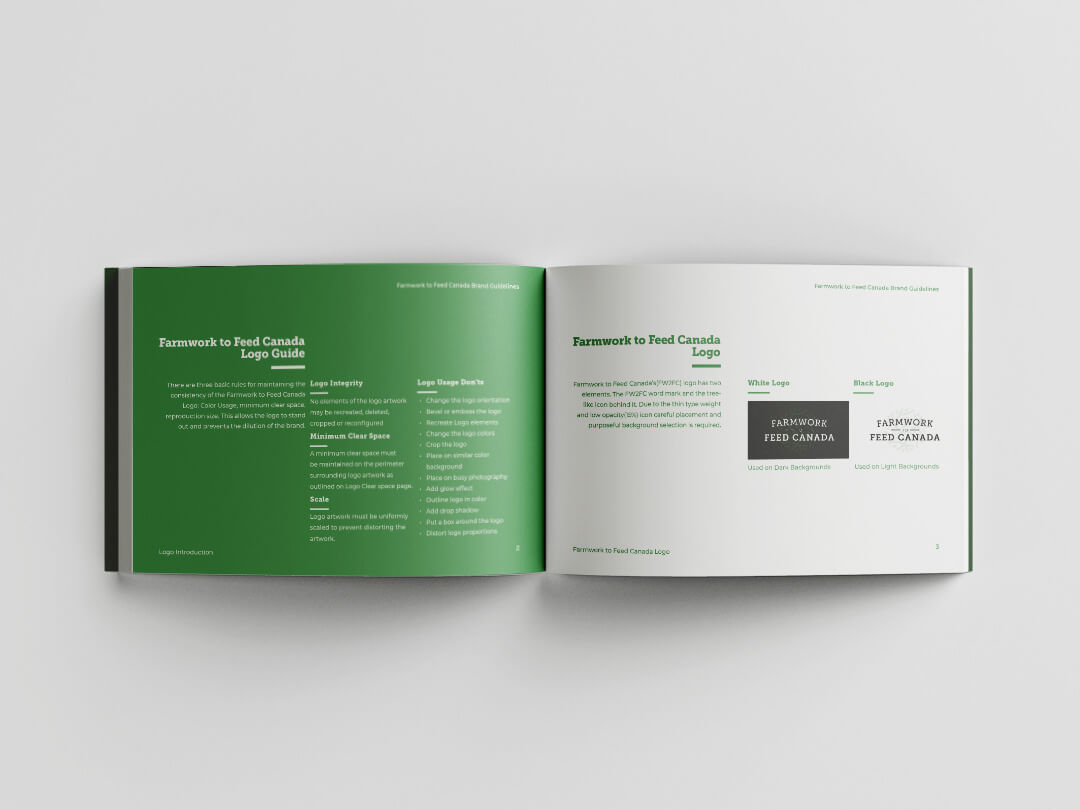
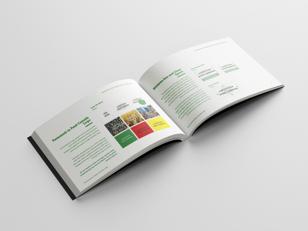
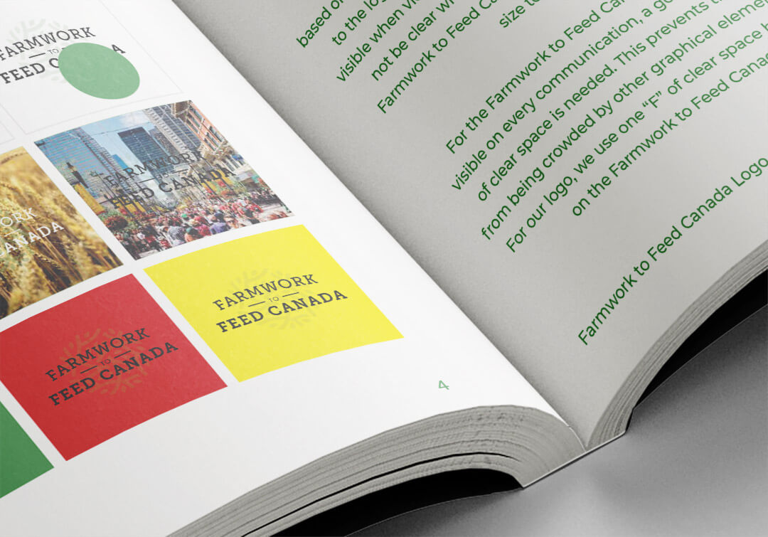
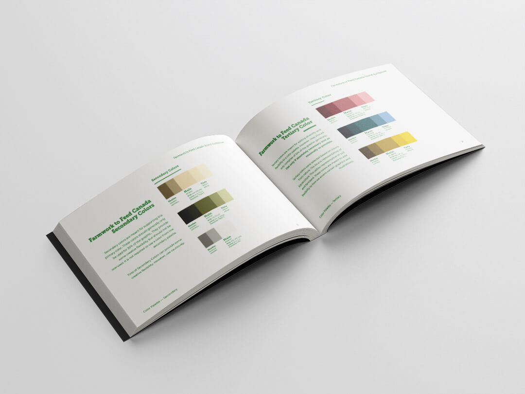
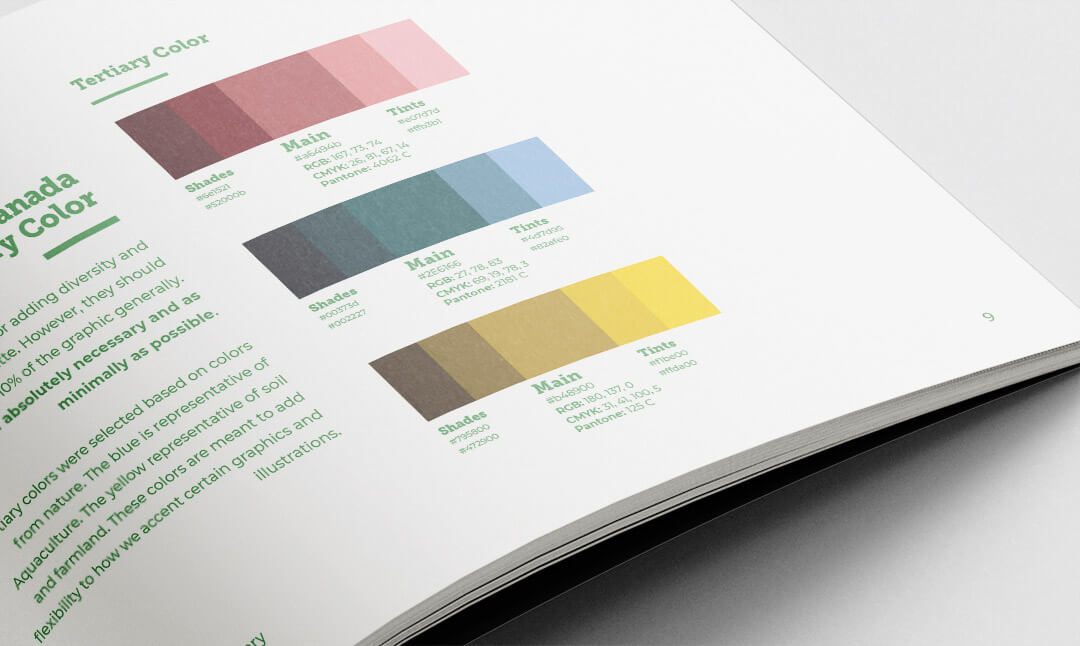
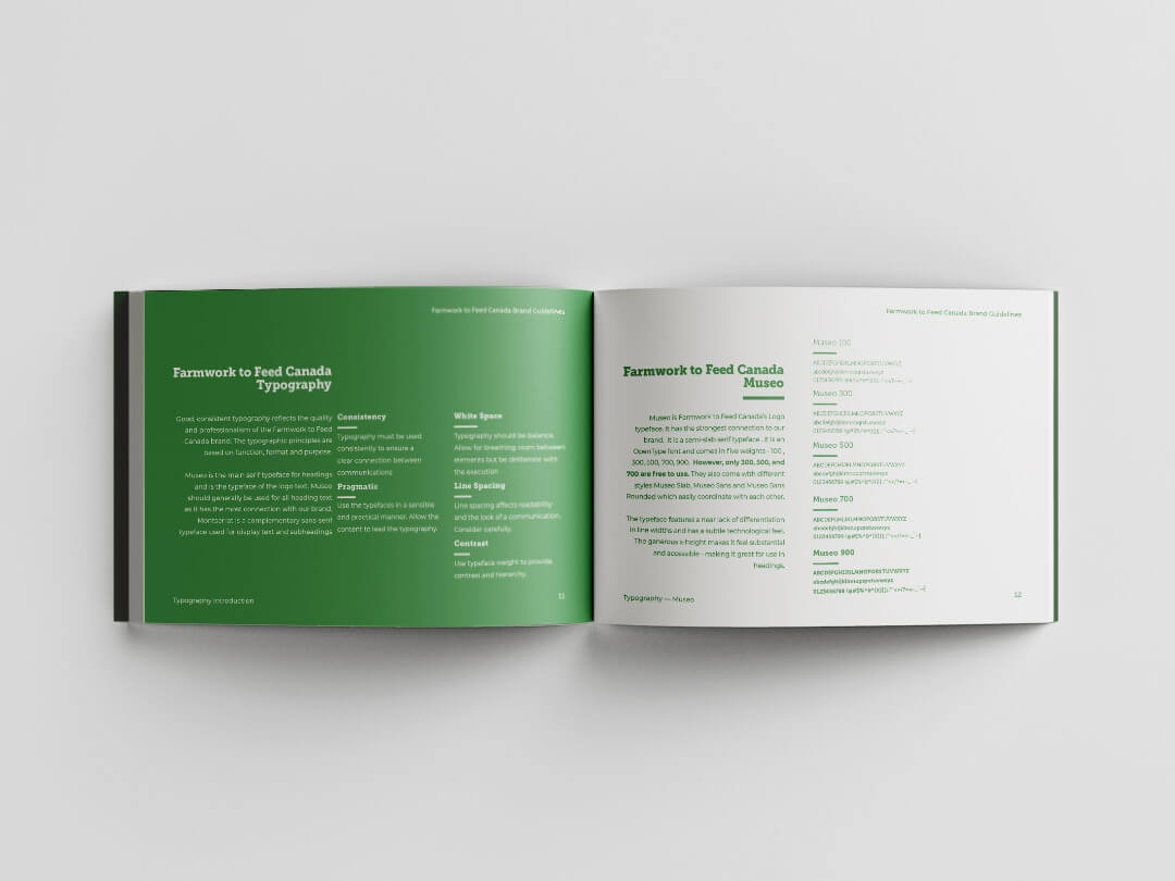
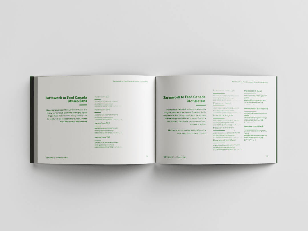
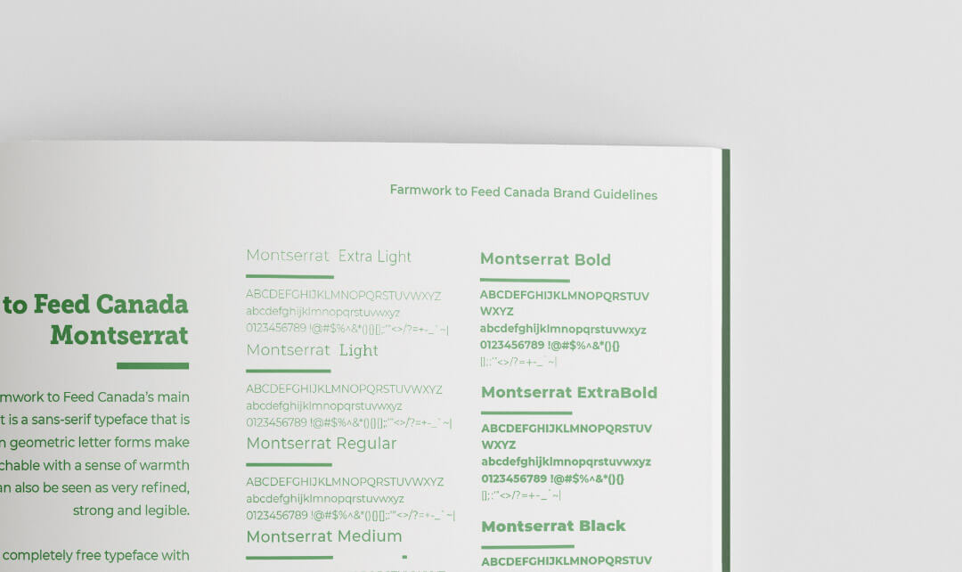
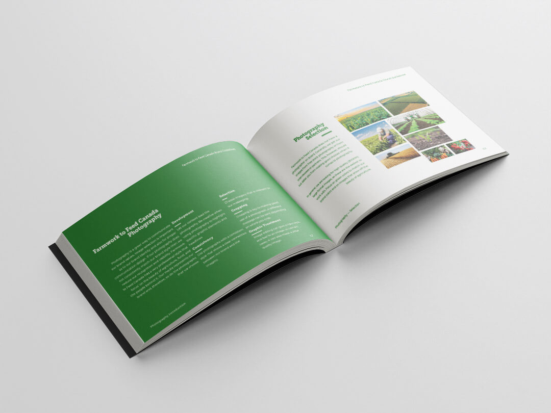
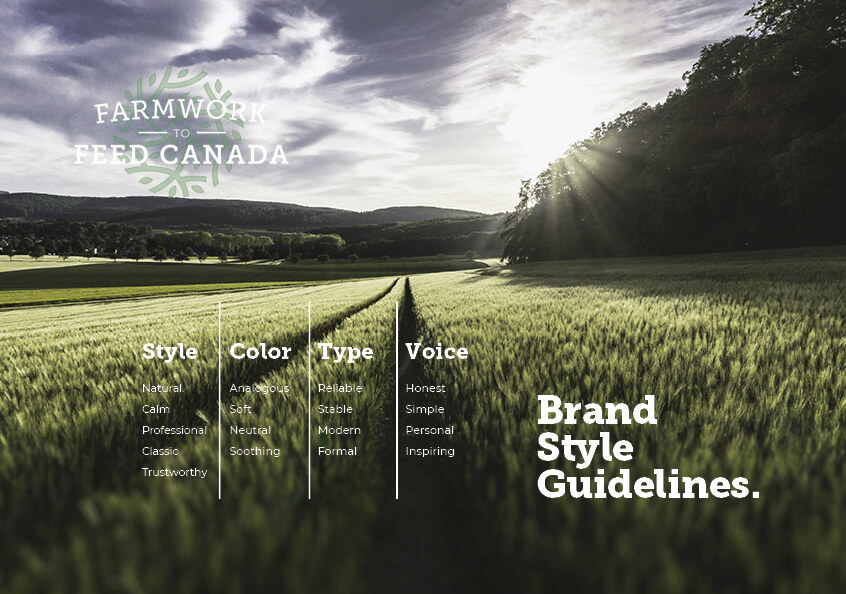
In my role of Creative Director at Farmwork to Feed Canada; I was tasked to refresh our branding guidelines to help create a more consistent style for our graphic assets. As many of our volunteer graphic designers were inexperienced , I focused my efforts on usability when creating guidelines for junior designers. The new branding guidelines explained the key points of how to use our logo, colors and typography in a clear and concise manner. Full explanations of why certain standards are set and visual references were provided. The overall look and feel of the guidelines also eluded to the essence of our brand. The new branding guidelines were well received and praised by our Strategic Leadership Team and by our volunteers.
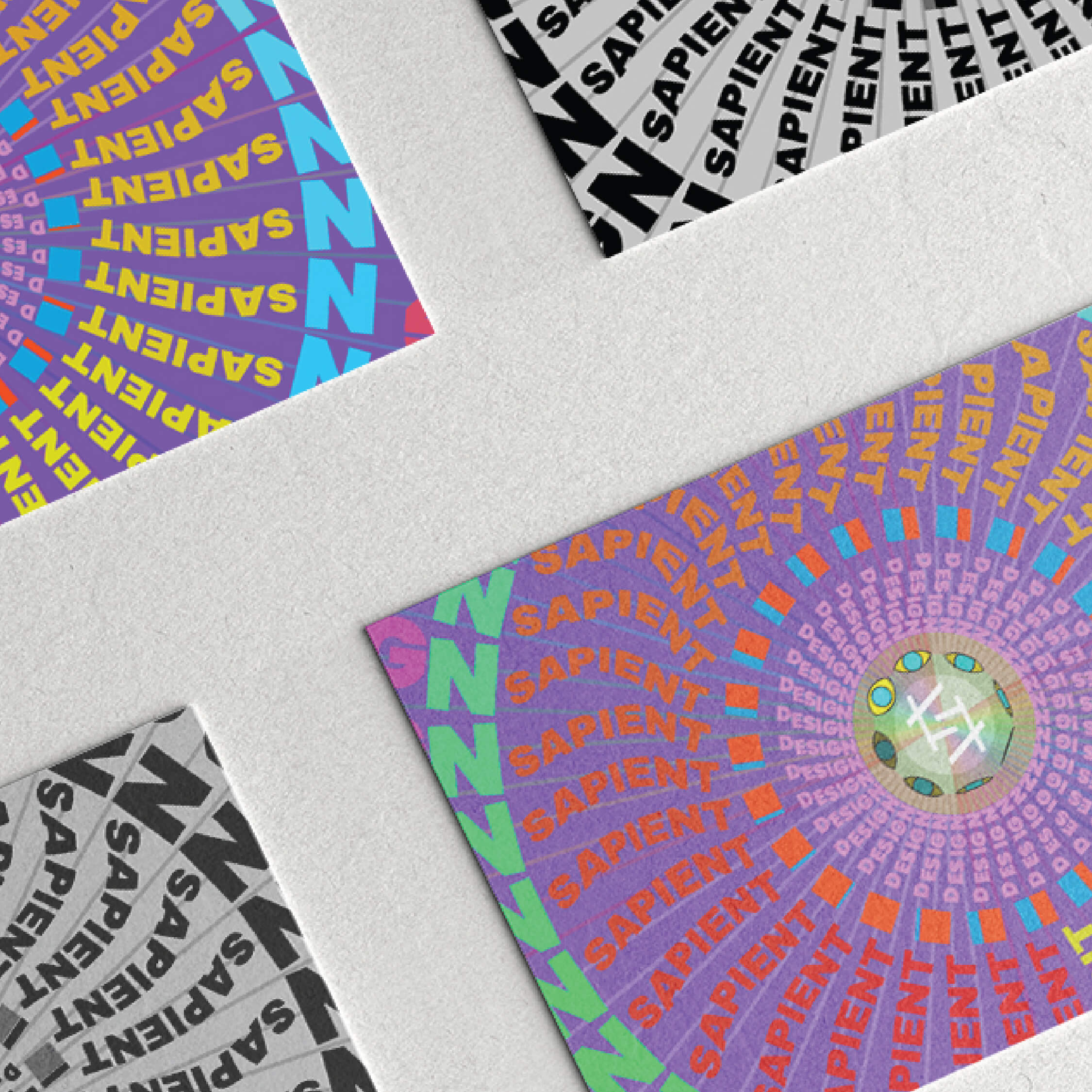
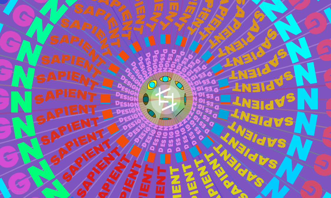
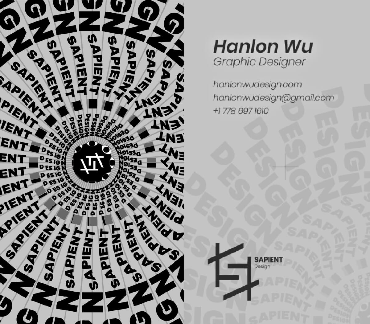
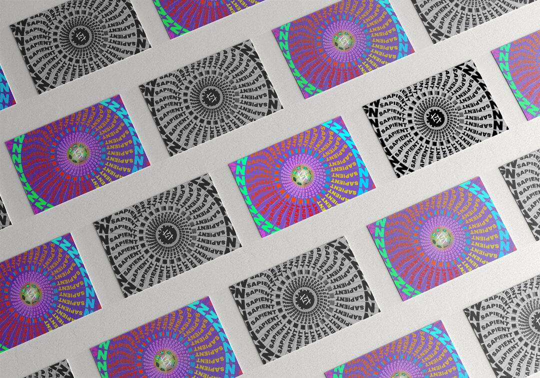
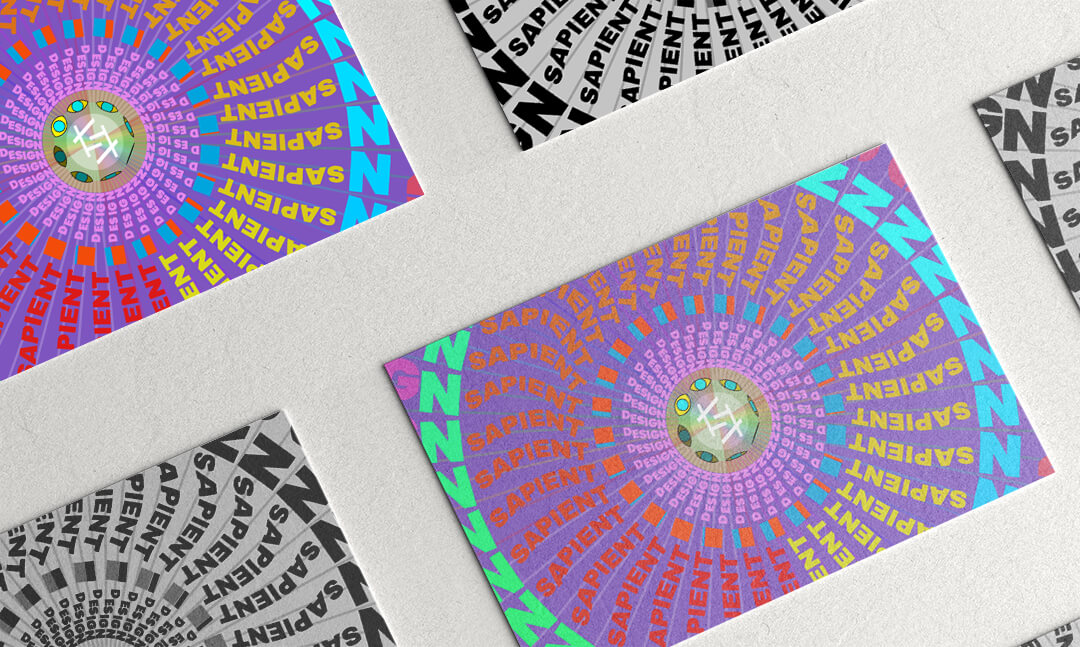
I love finding new techniques to incorporate into my design. Zoetrope is an early animation technique that uses rotation to create the illustion of movement. Incorporating this technique into my business card design was challenging and I learned a lot about design and animation through the process. Experimenting with new mediums to broaden my creative knowledge only strengthens my design ability. Though the business card isn't usable to a vast majority of situations (you would need something that spun at a consistent speed) - the process of creating it was enjoyable and created a business card that was unique and memorable - though the psychedelic colored version is hard to stare at for a prolonged period of time (haha). Expanding your horizons and repitore is what great designers are all about. Creating something that goes beyond what you were previously capable of helps you grow into a better designer.
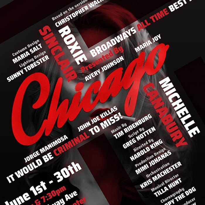
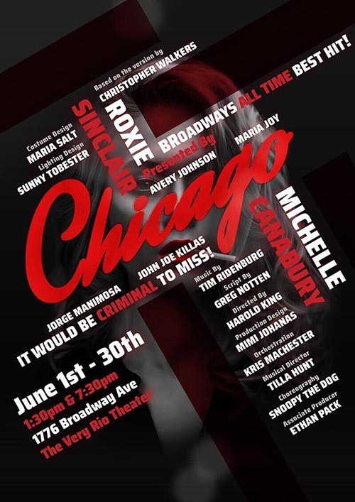
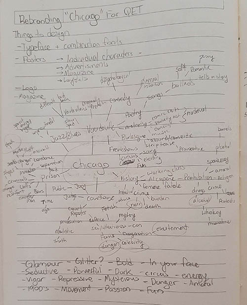
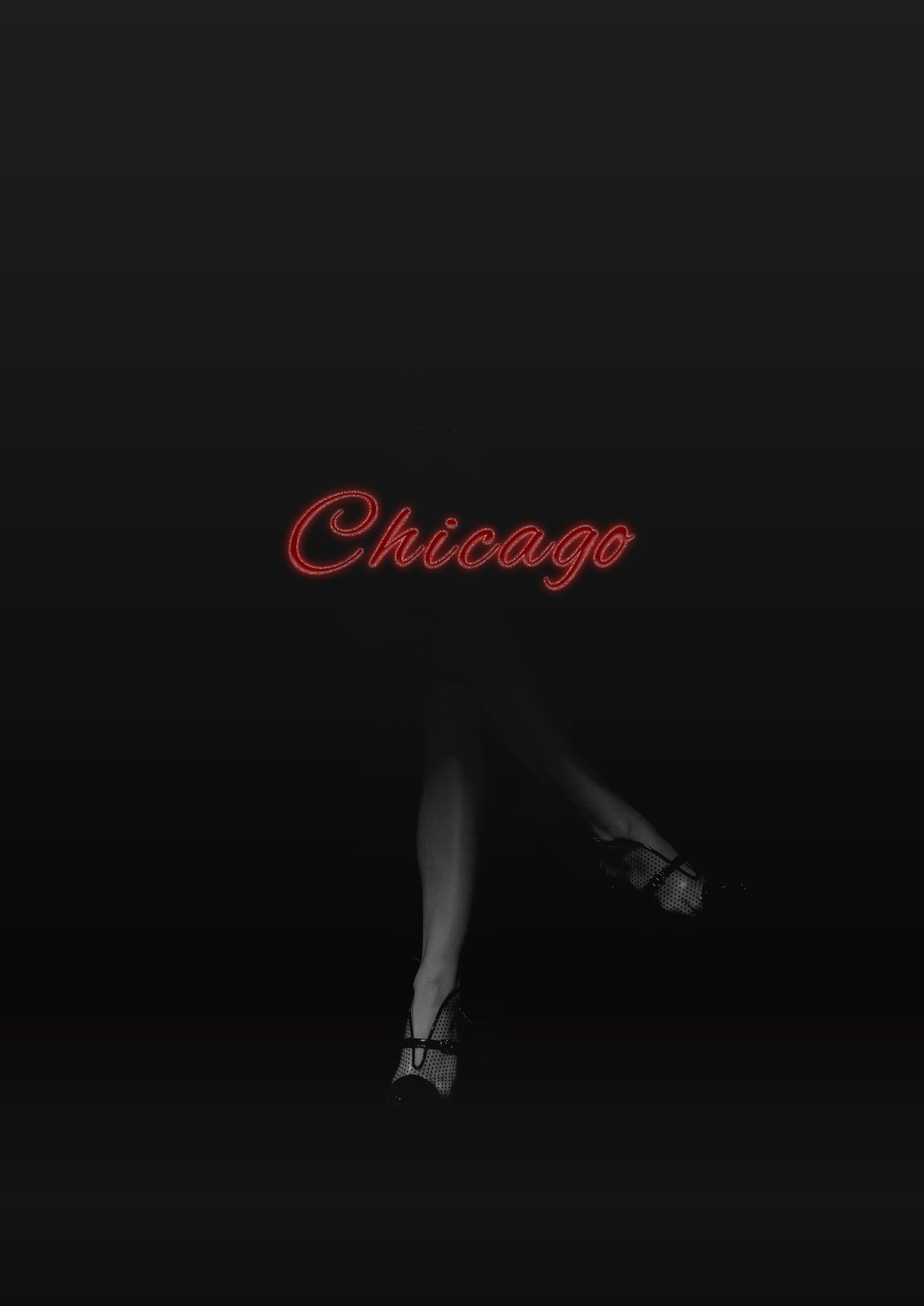
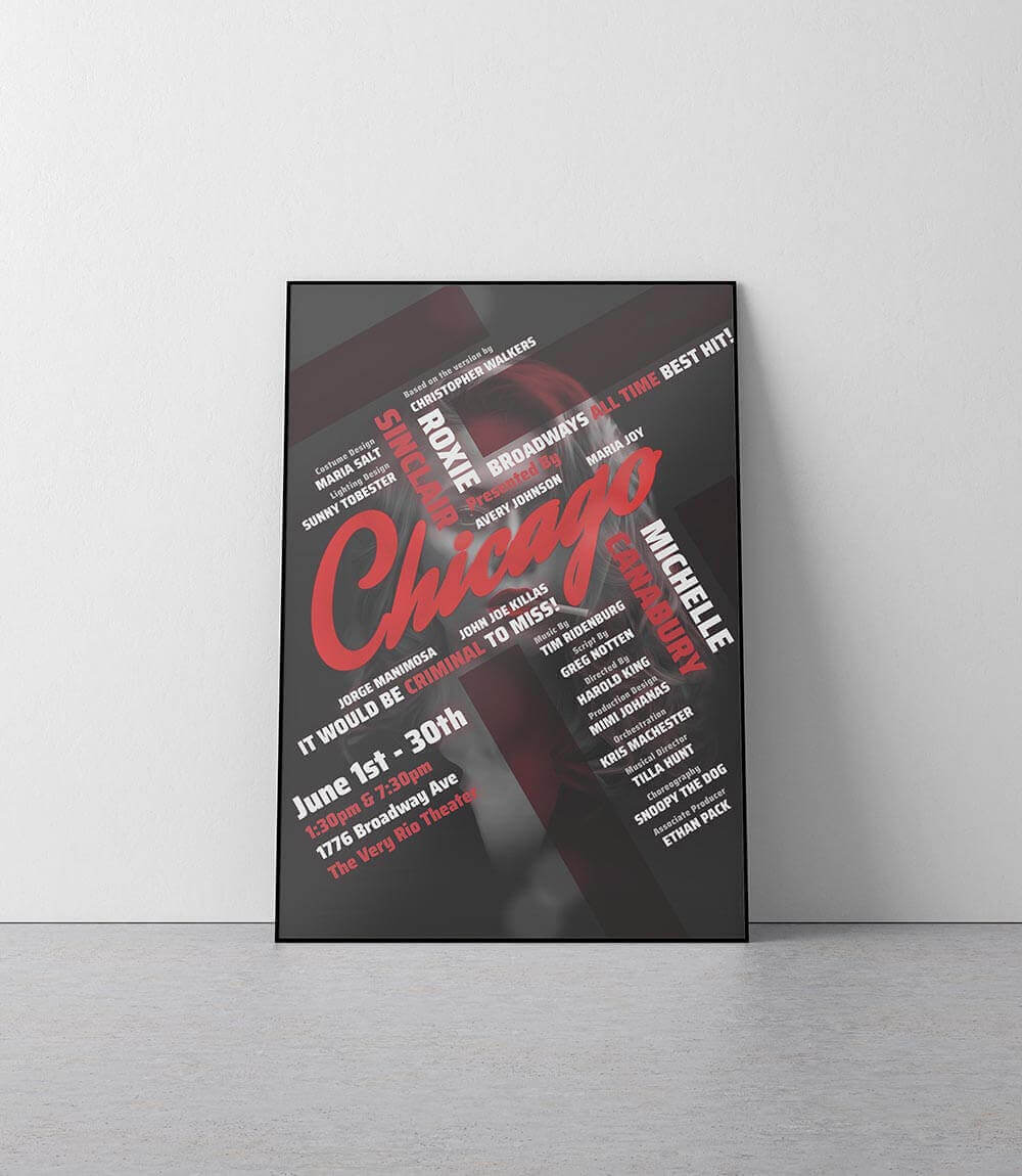
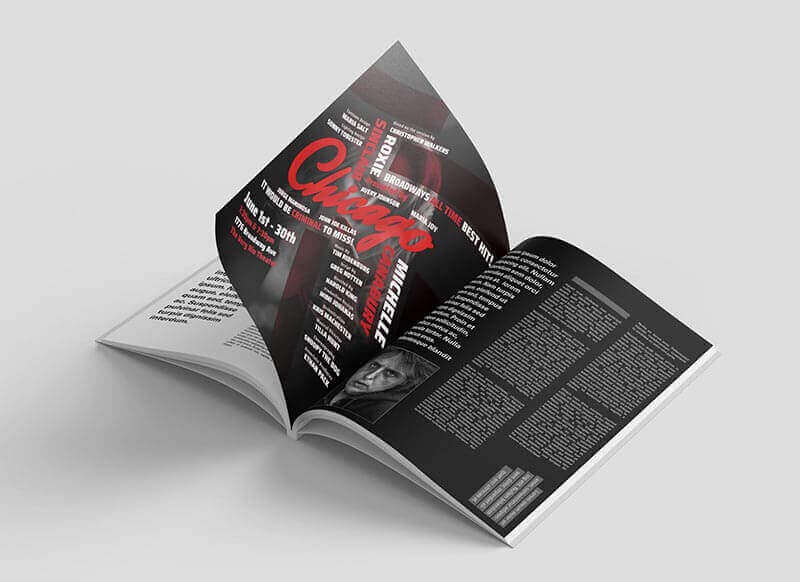
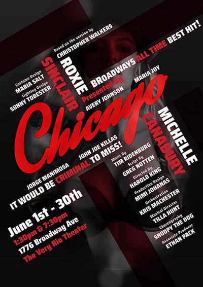
People enjoy doing what they are most comfortable with. I feel differently about my comfort zone. I like pushing boundaries and challenging myself to try something I haven't done before. The Chicago project was created for a Portfolio Development Course at Emily Carr University. I wanted to see if I could develop a great design with no prior knowledge of the subject. For me, I had always thought that Chicago was about Al Capone and Prohibition in the United States - I was very wrong. The design I developed captures the grand Vaudeville style of the musical and plays with its noir-femme Fatale imagery. The project was a good way to learn about brainstorming and research; which play an integral part in the design.
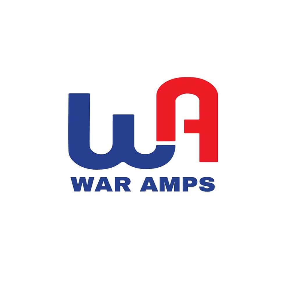
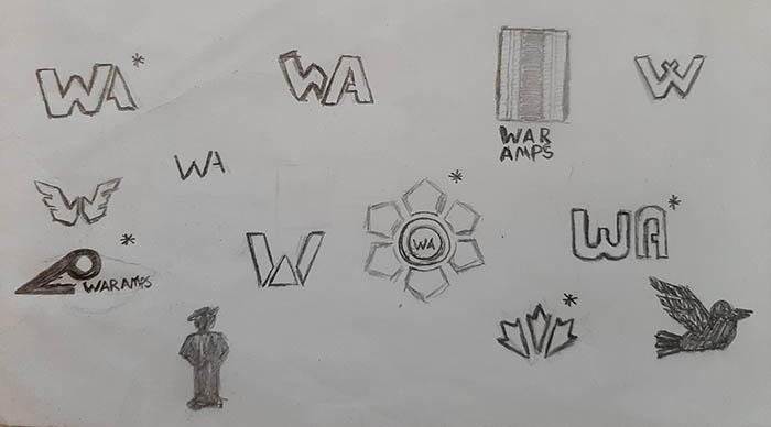
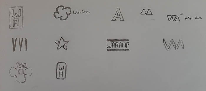
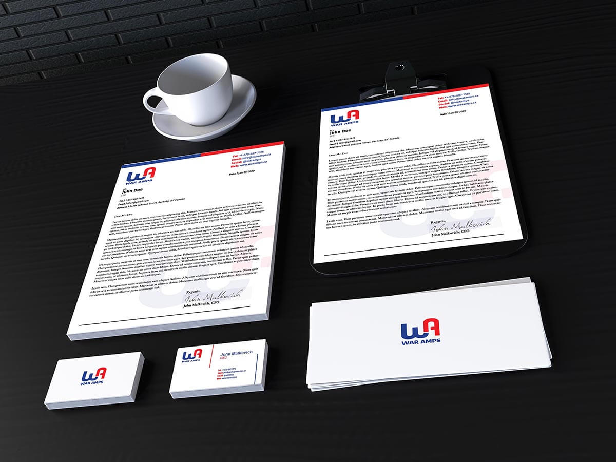
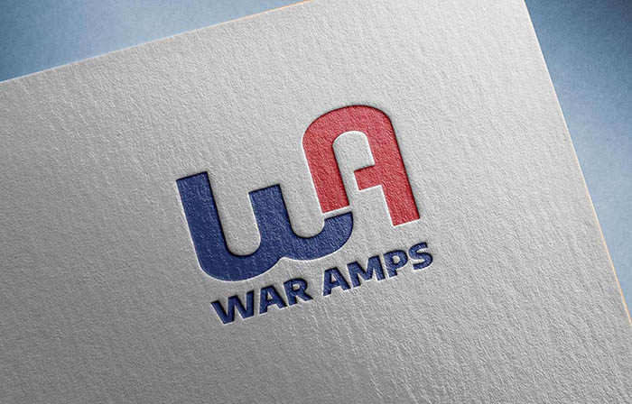
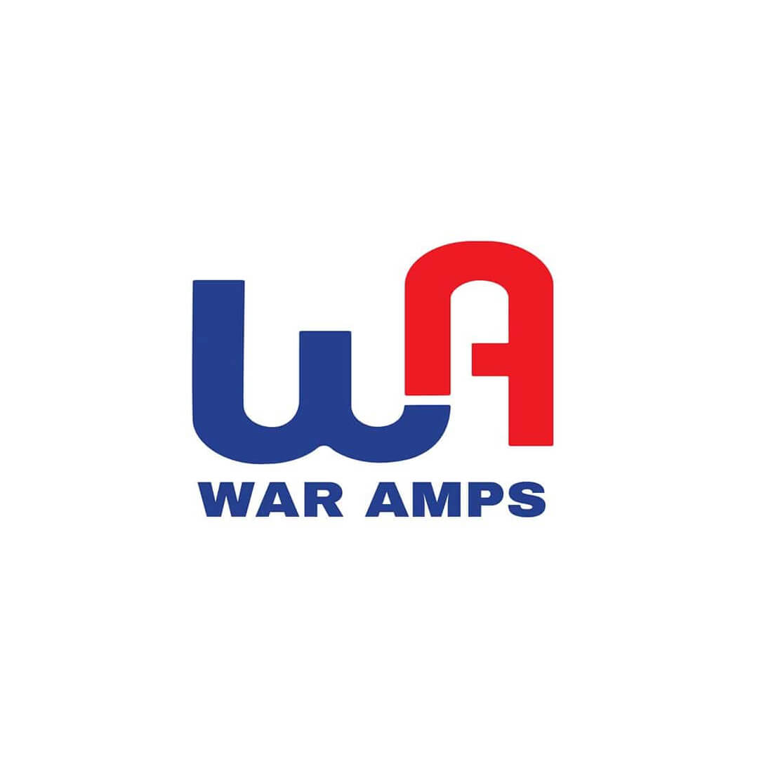
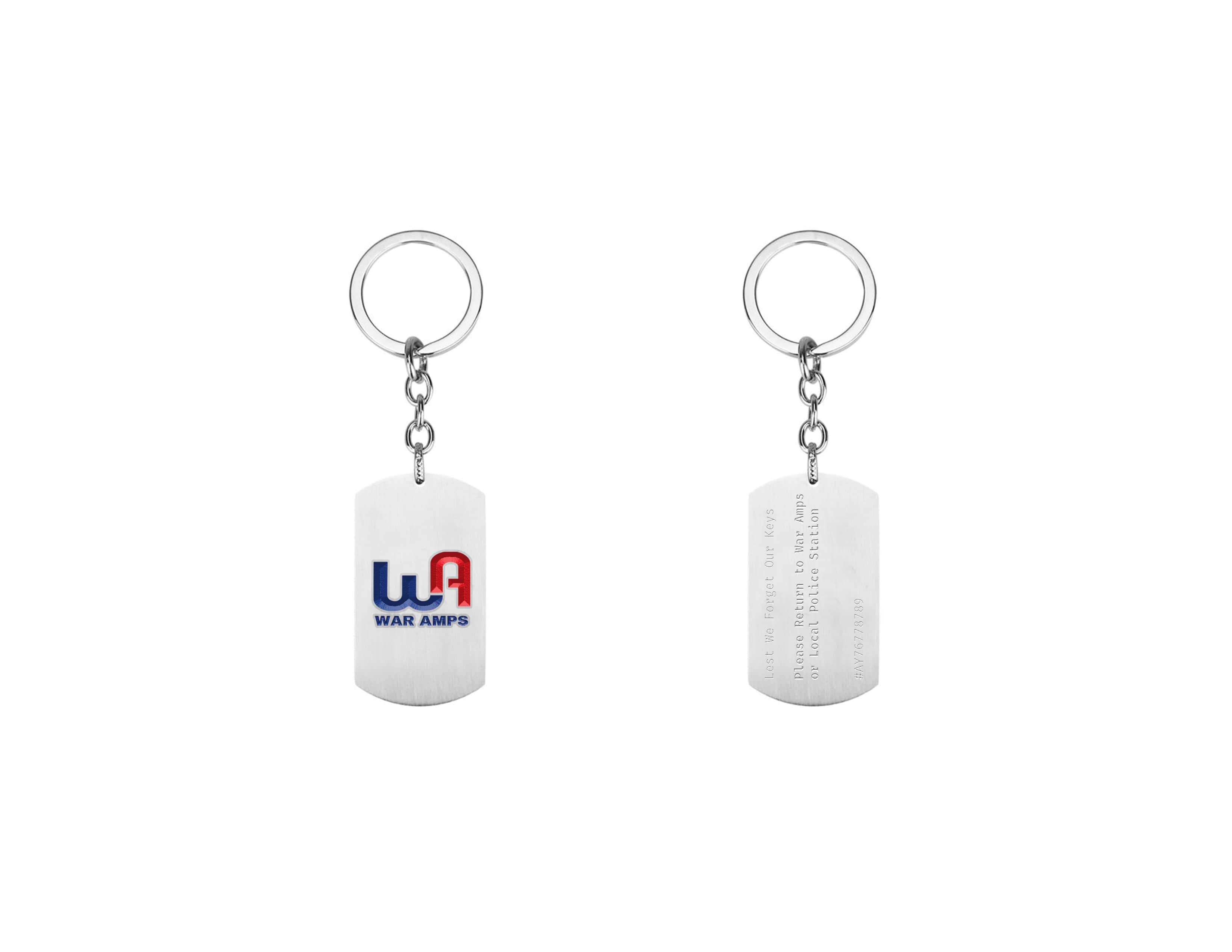
This War Amps Logo Redesign was for a Major Projects class at Emily Carr University. Each student was assigned a real organization to learn about organizational branding and logo design. The logo that I designed gives a modern feel to the organization while maintaining their tradition and symbolism. From a new, modern logomark - I maintained the color palette and typography style of the original brand. The shape of the letters became based on the Unknown Soldier Monument in Ontario; a key element in their original logo. To represent the War Amps motto "Amputees helping Amputees" - the arms and legs of the letterforms were cut and connected together; symbolizing amputees supporting one another.
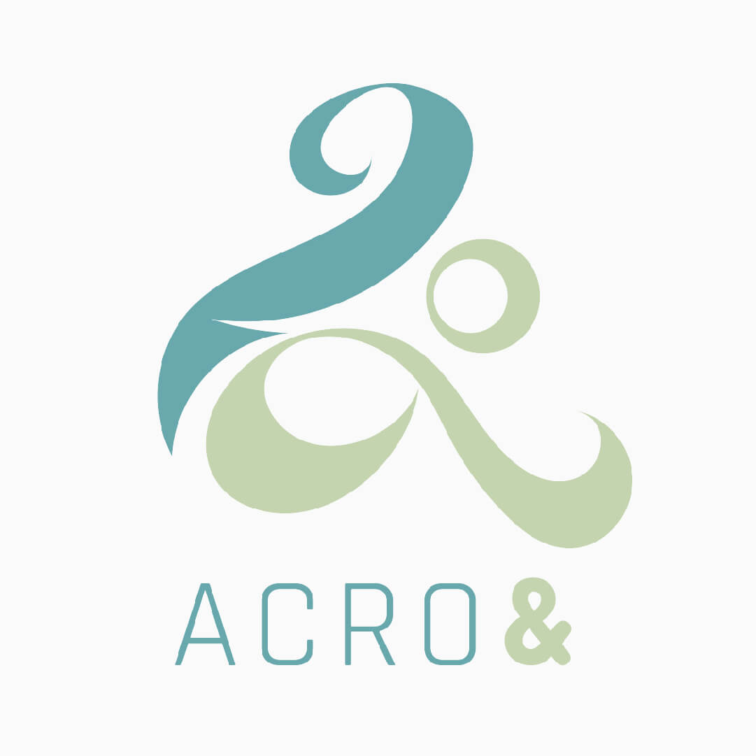
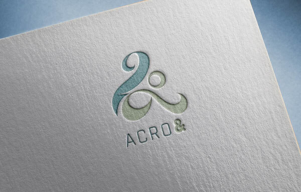
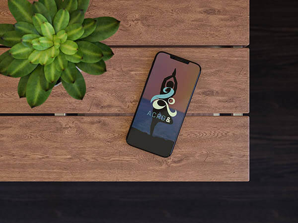
To develop my understanding of logo and branding design I signed up as a designer on 99Logos. Acro& was a logo design brief for acrobatics and yoga studio based in the United States. The clients were looking for a modern design that exemplified movement. The result was a logo that showed both the dynamism and tranquility of the company. The logo ended up being a finalist in the contest.
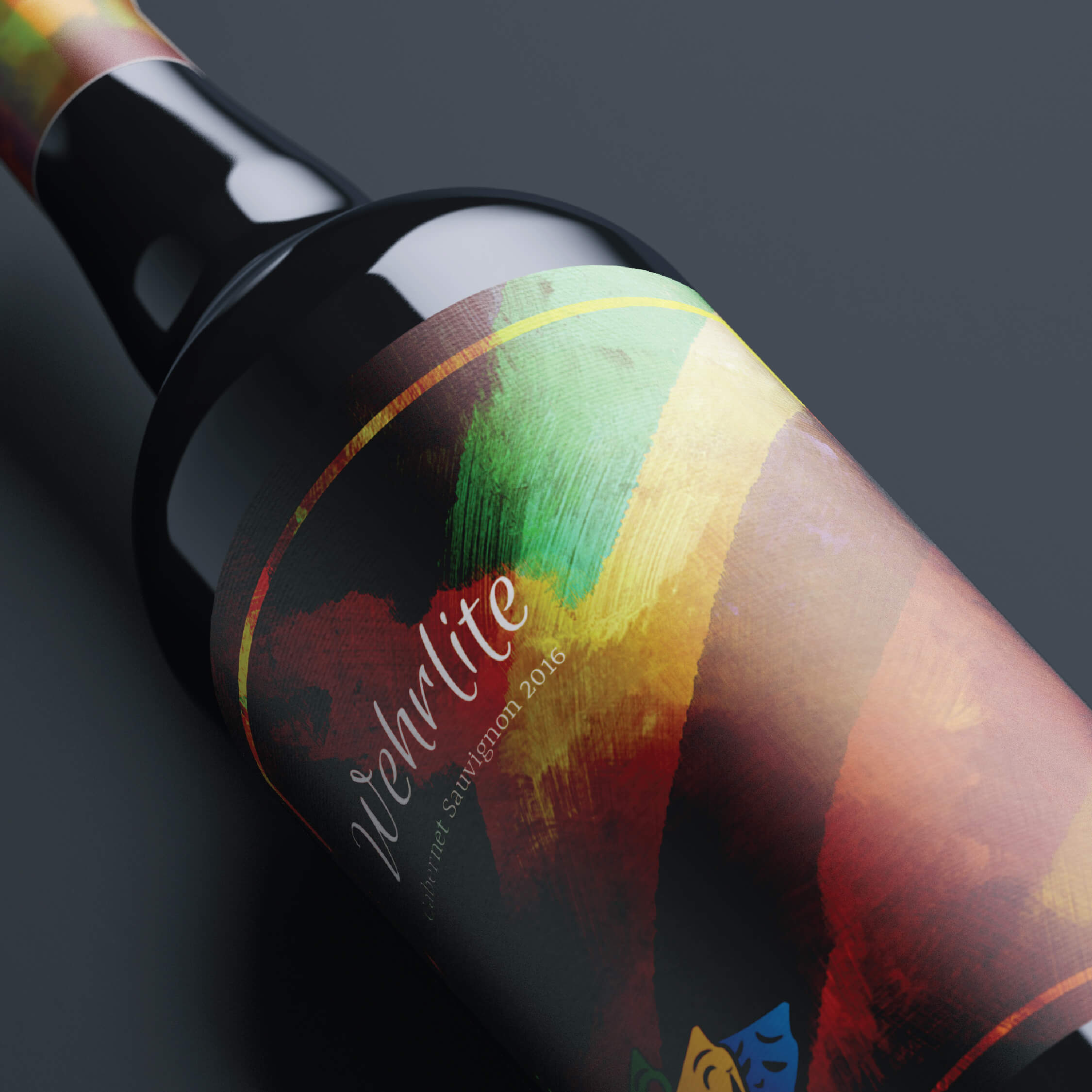
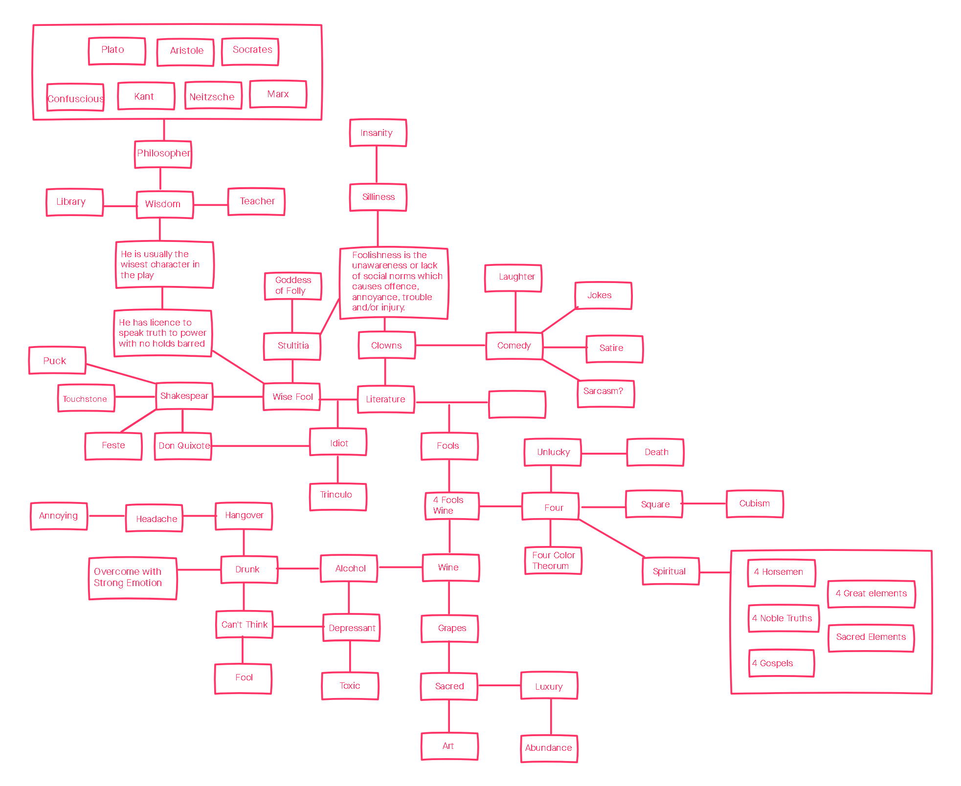
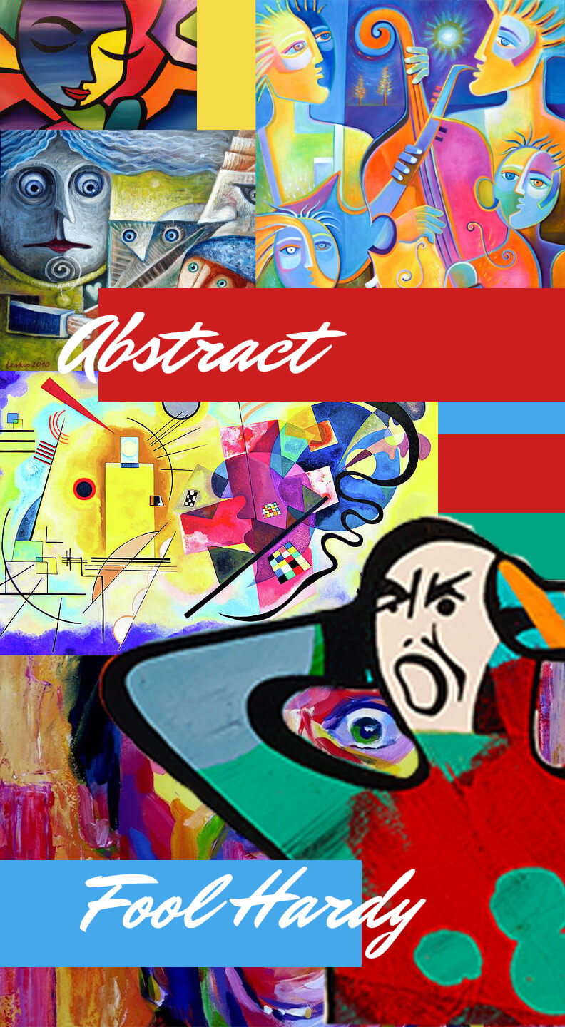
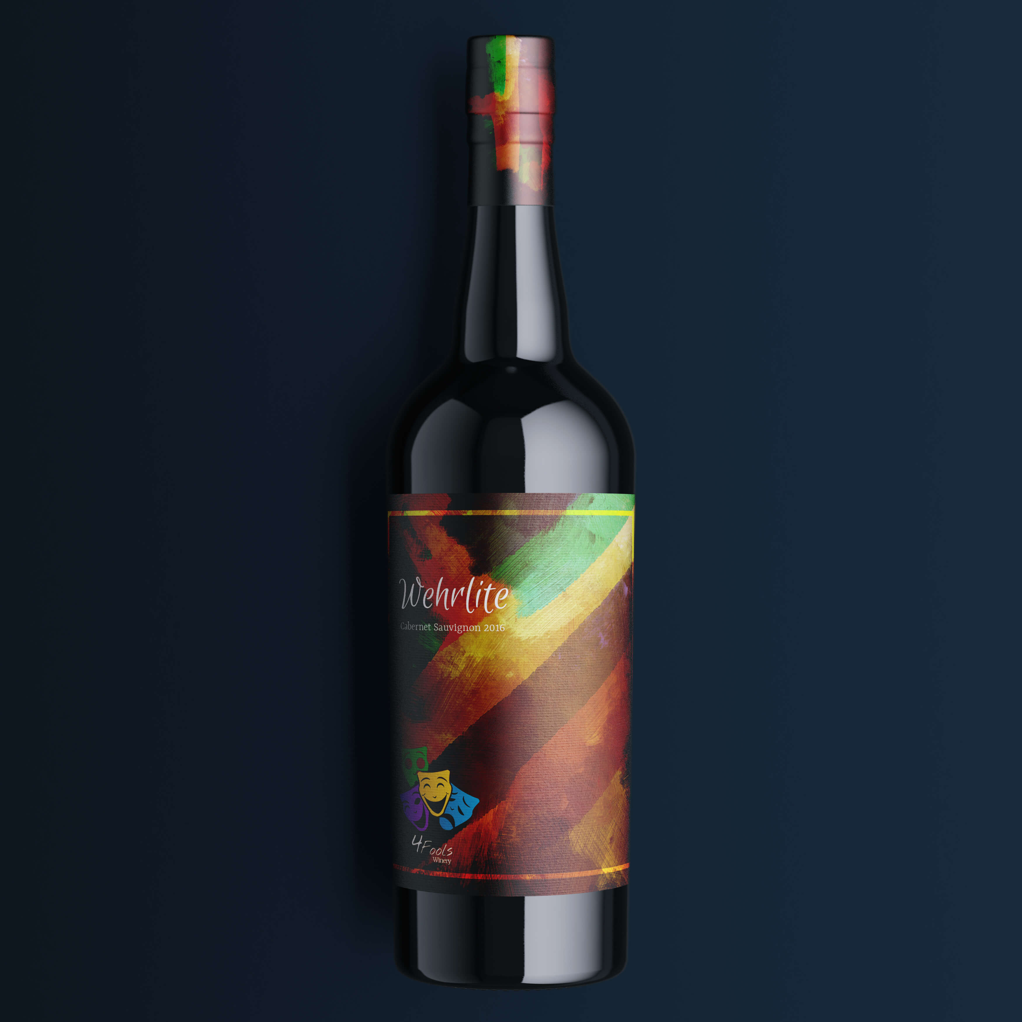
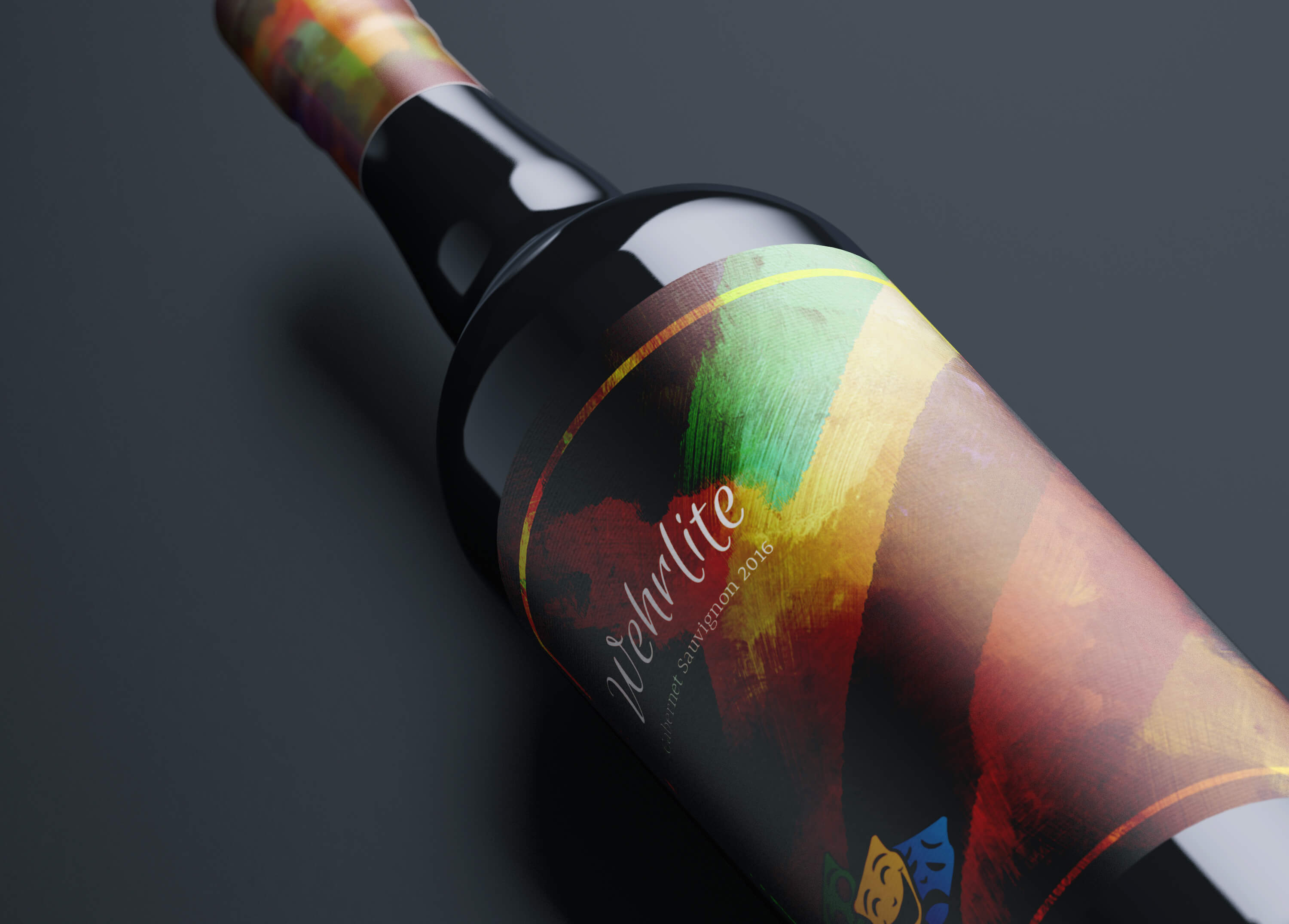
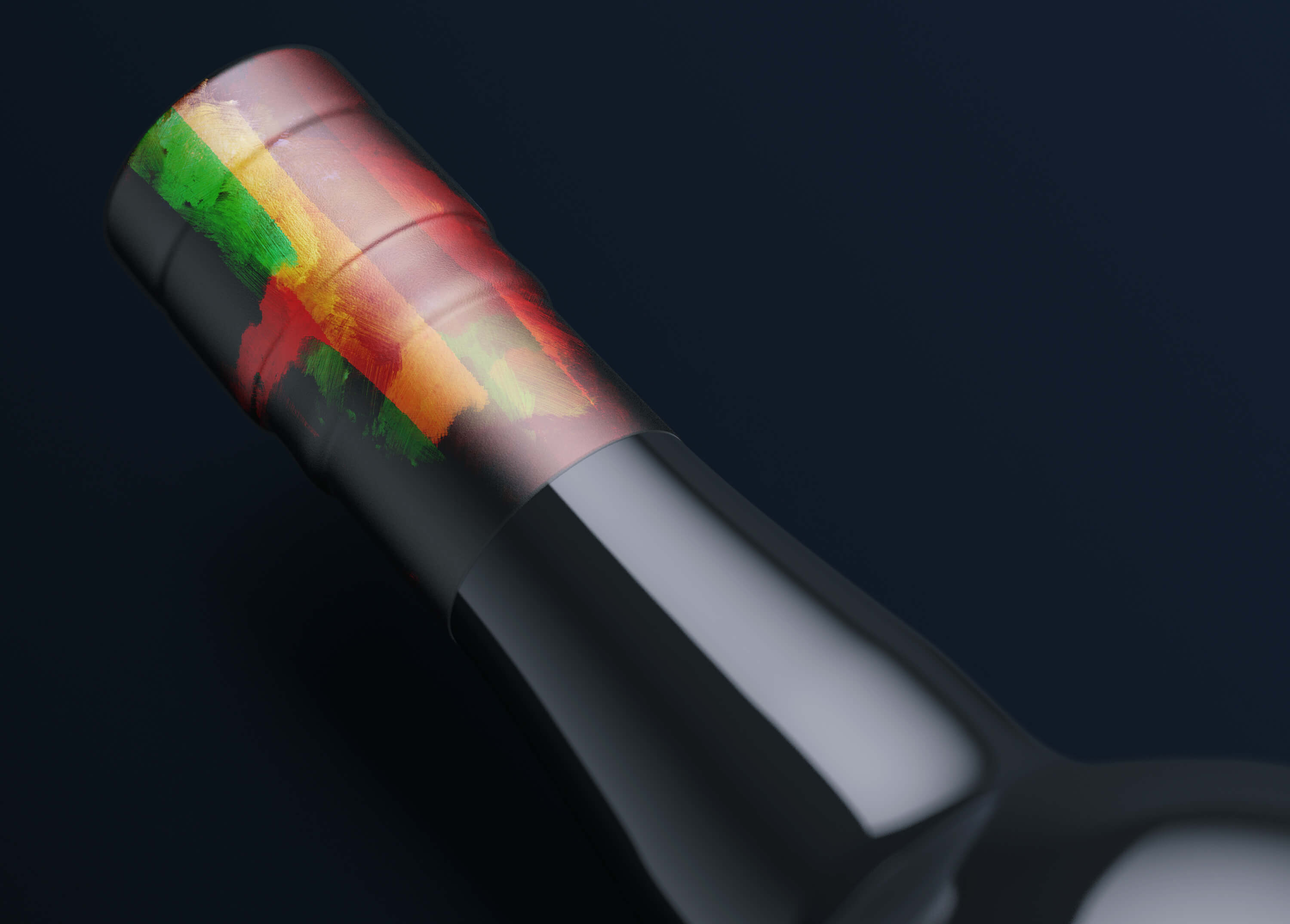
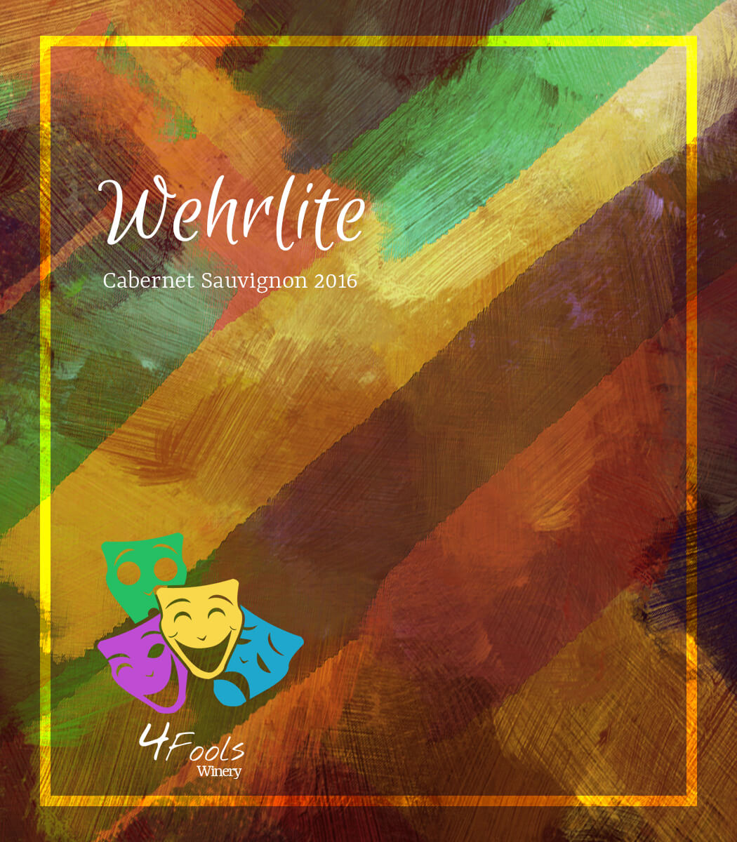
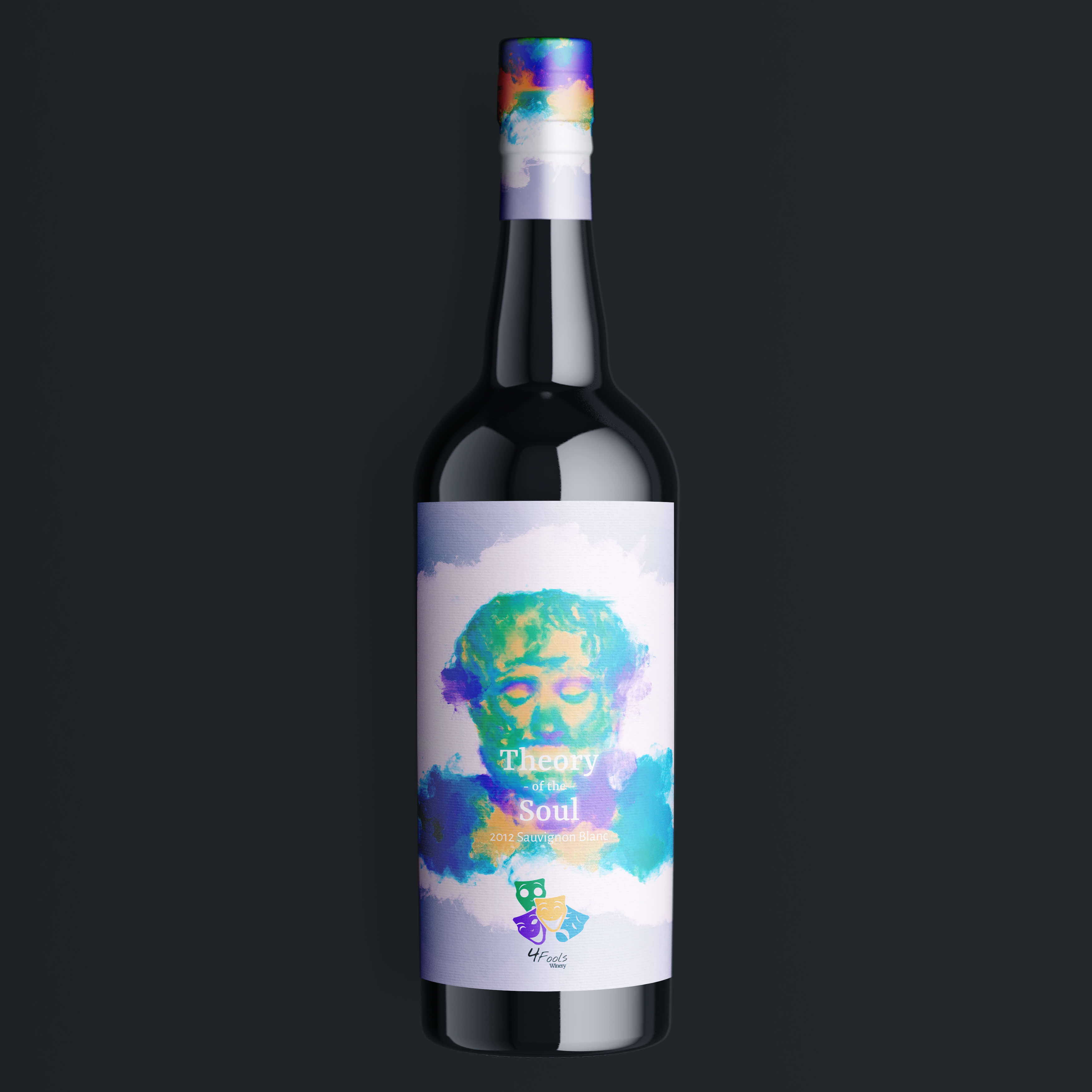
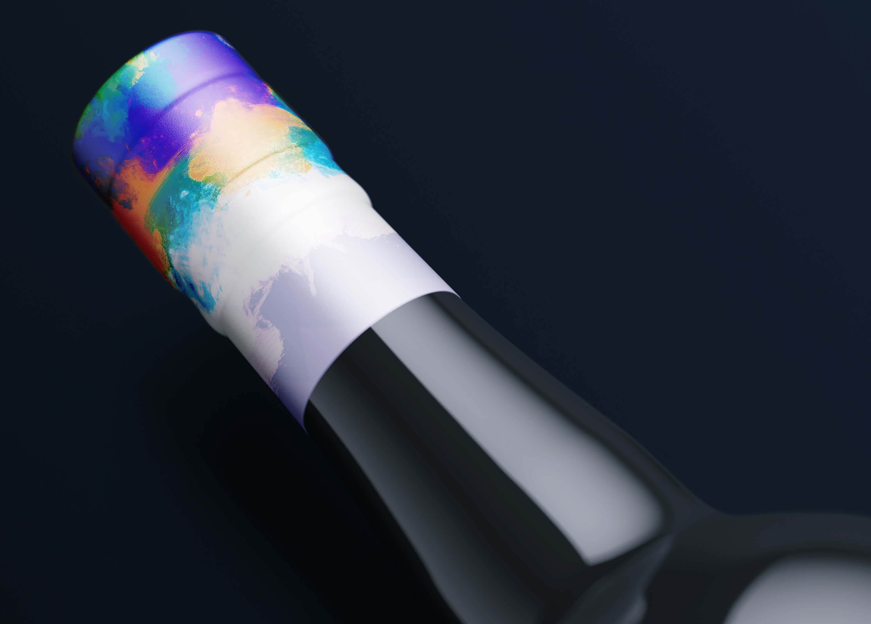
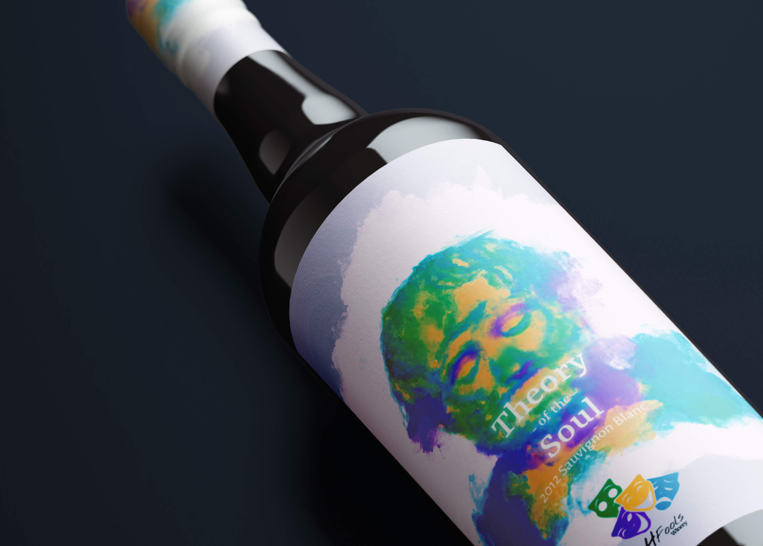
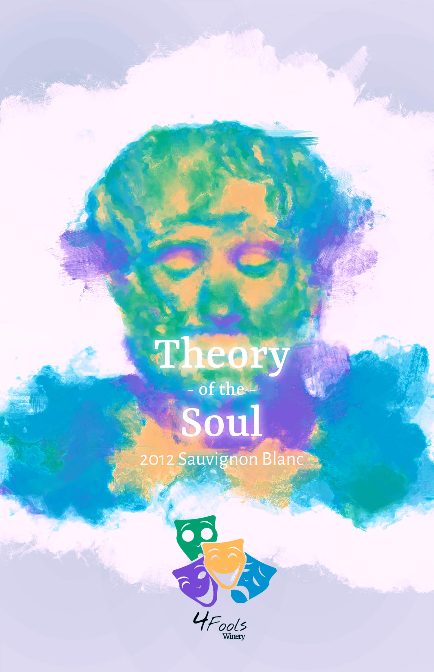
What is an identity? Aan identity serves to tell the world who you are. It is an intangible feeling you get when you meet someone and the lasting impression that remains after you say goodbye. For a business, just like for a person, your identity is what makes people want to come back. When I develop brand identities I dive deep into the core of a business. Finding connections to subjects related to the brand - all the while compiling the relevant information into something unique and surprising. The brand I created for 4 Fools Winery showcases this well. The idea of "fools" relates to both drunken stupidities, but also literature. A recurring character type in many Shakespearean plays(among others), a commoner who uses his wits to outdo people of higher standings. For this brand, I designed a logo mark and two wine labels. I aimed to imbue all the design work with a sense of down-to-Earth artistic class, fun, and style.
-->
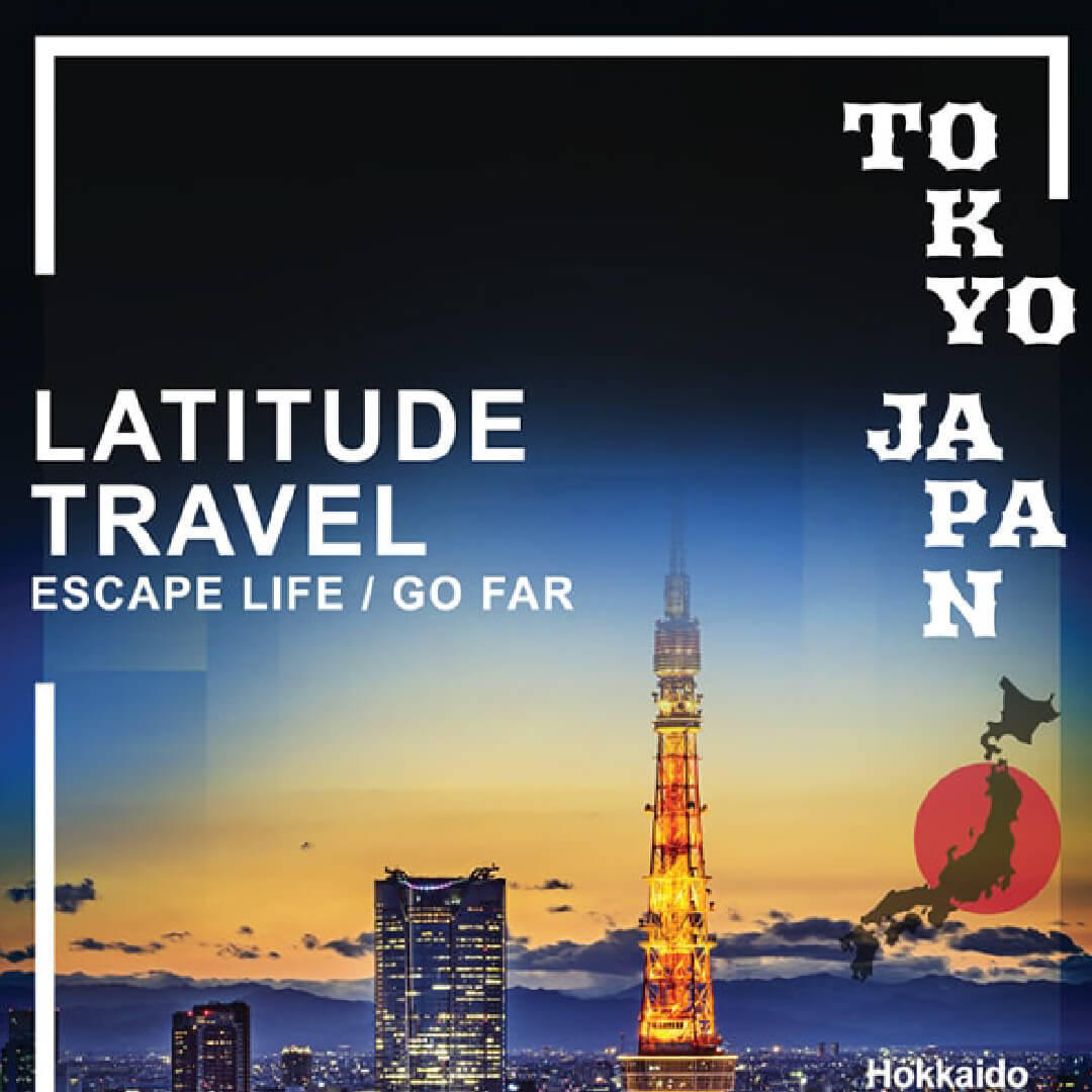
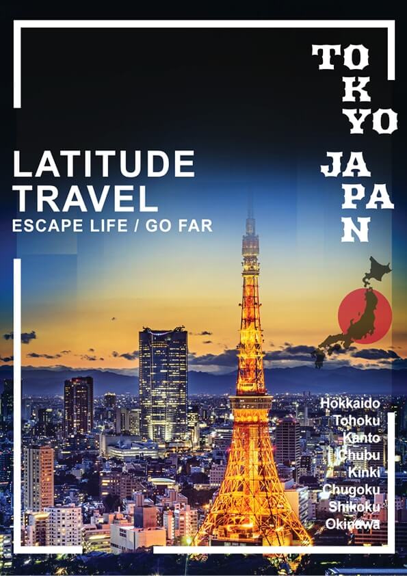
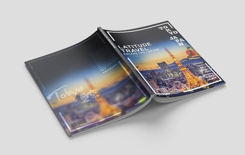
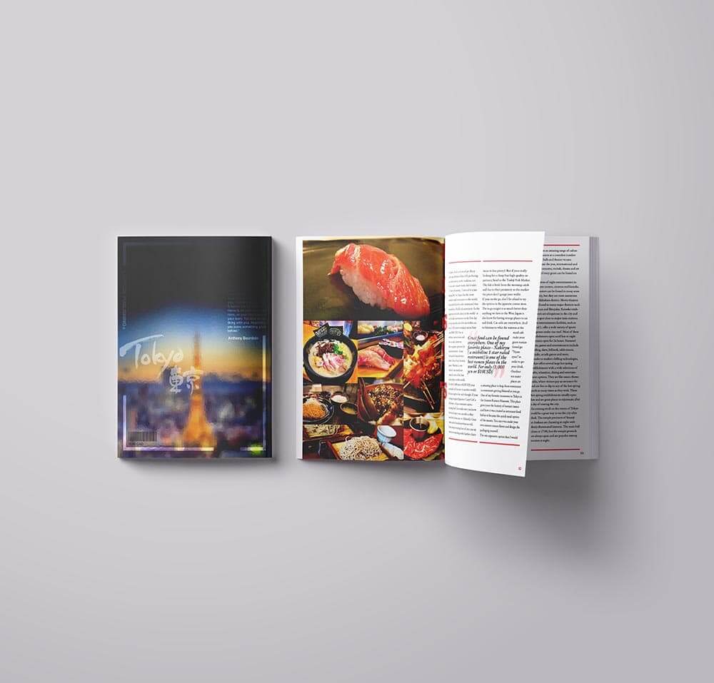
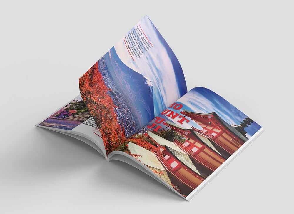
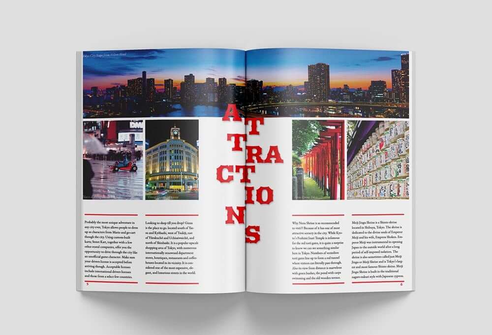
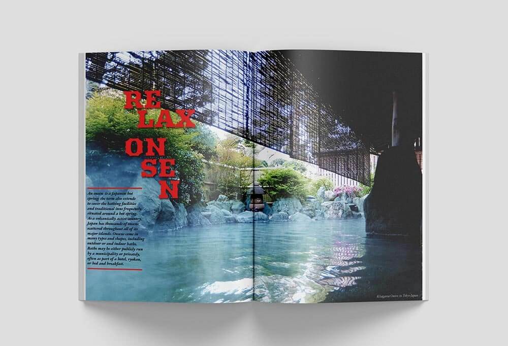
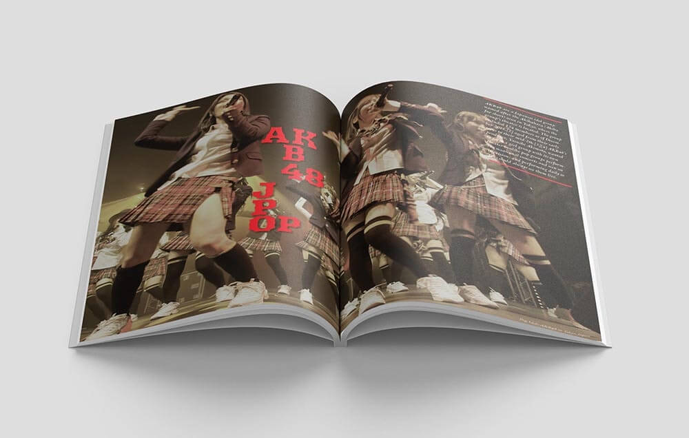
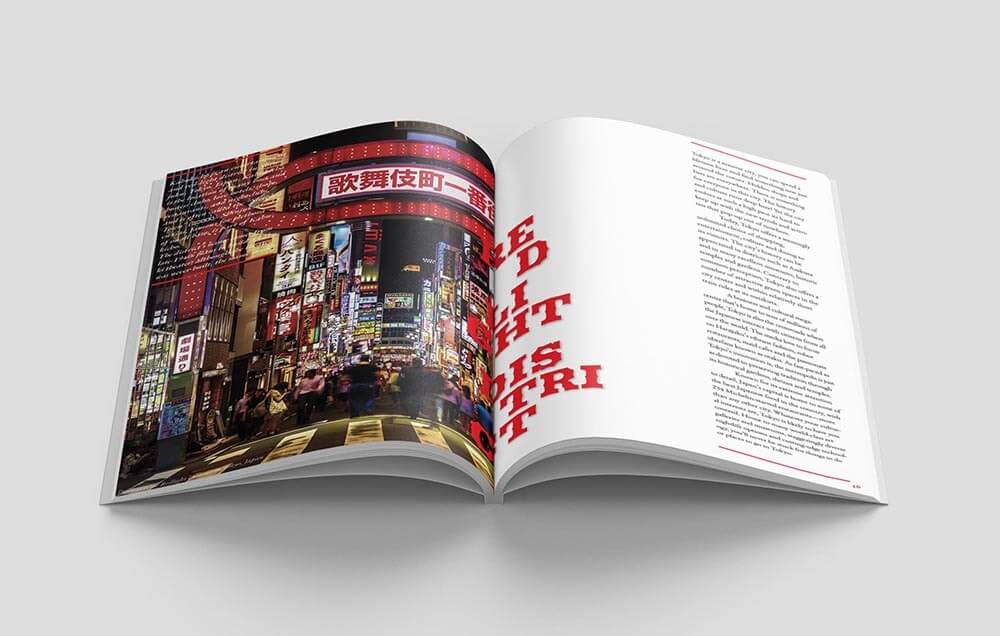
Latitude Travel Magazine was a student project that challenged me to experiment with InDesign page layouts. The goal was to create a professional-looking magazine using a consistent grid structure. At the same time, I looked to create motion throughout the magazine pages by playing with the typography.
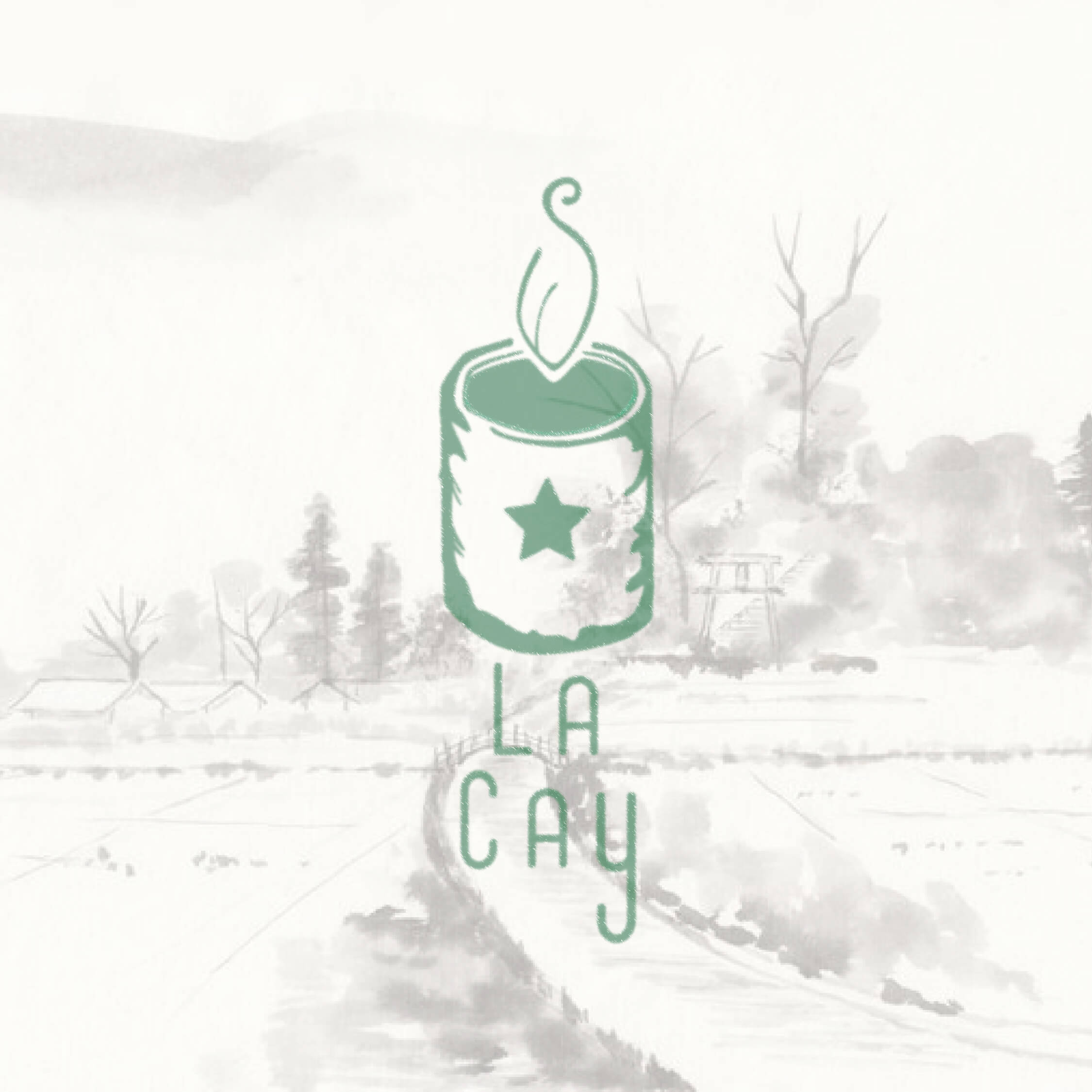
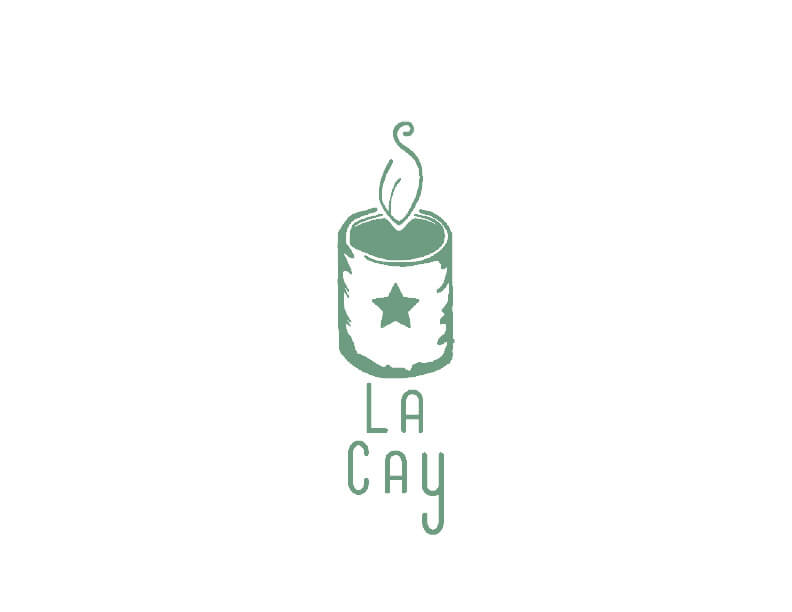
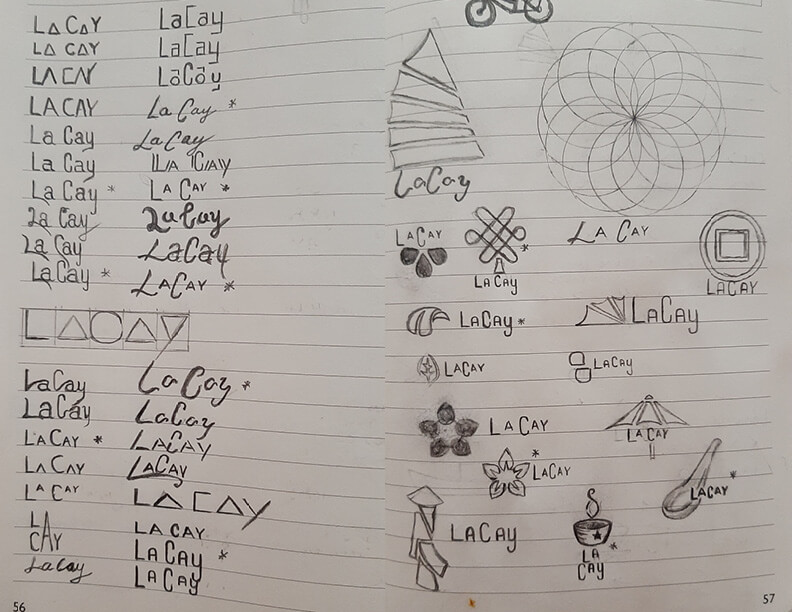
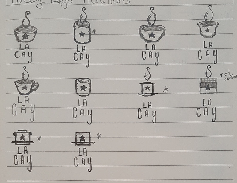
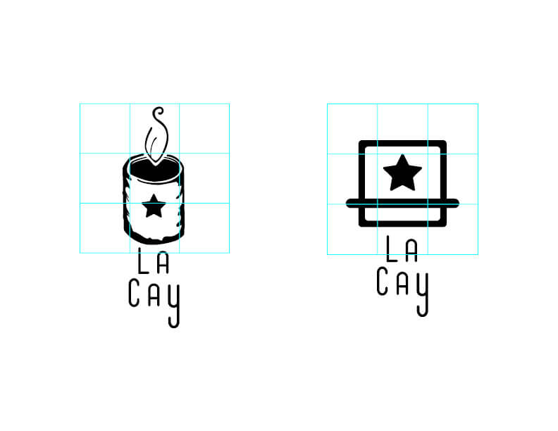
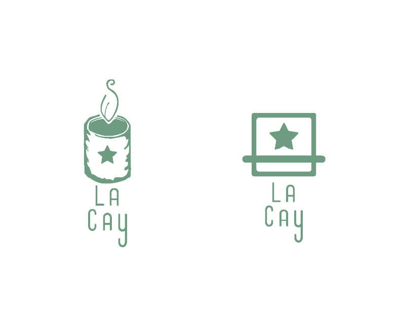
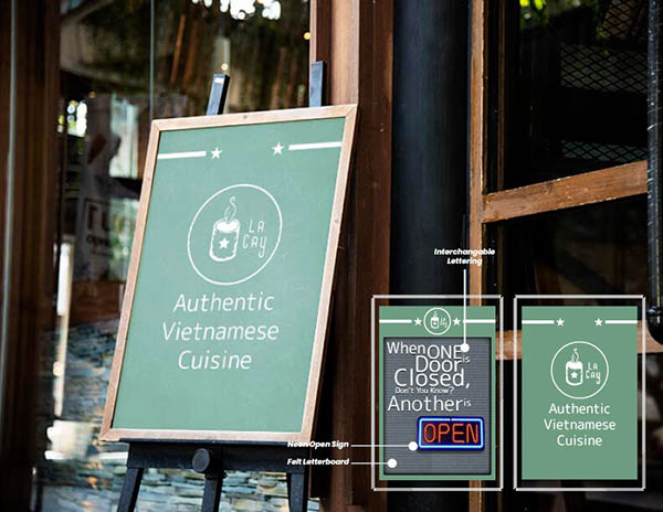
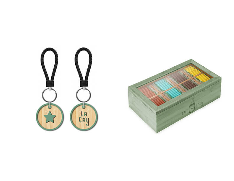
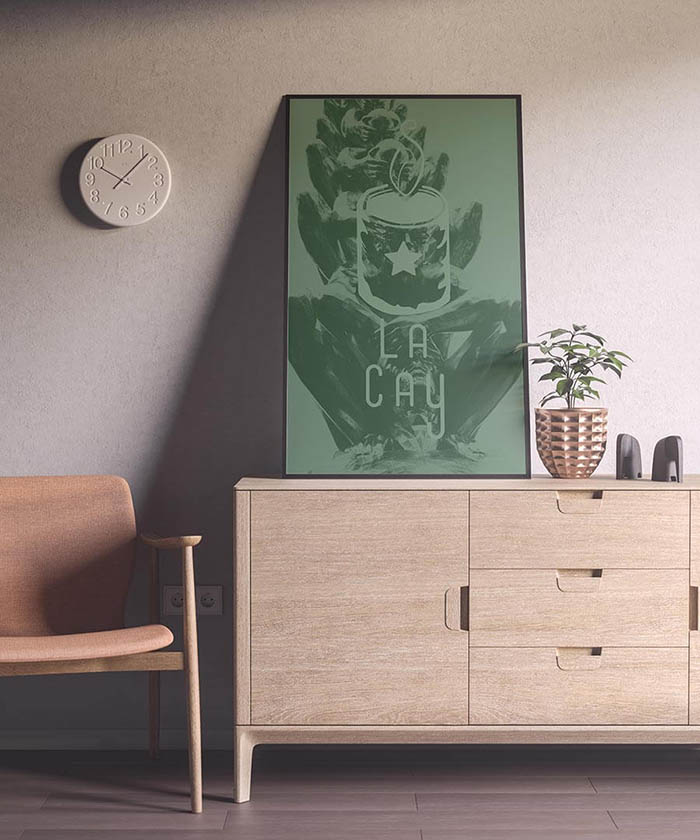
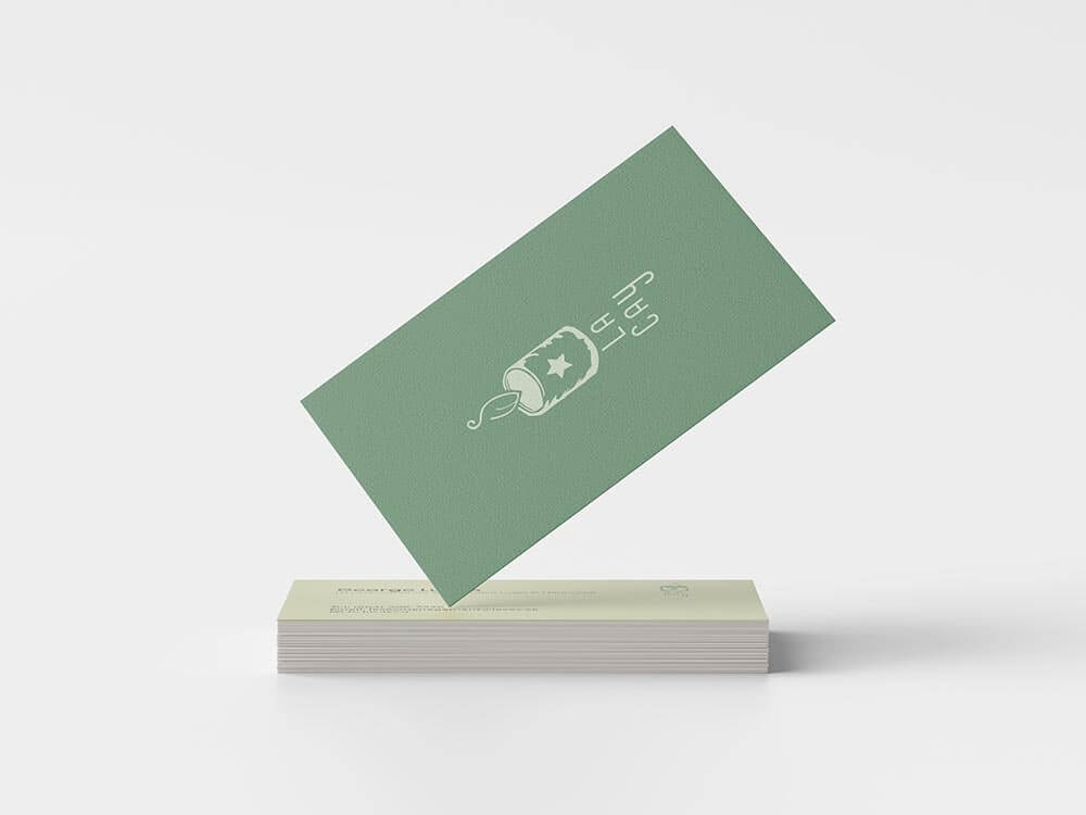
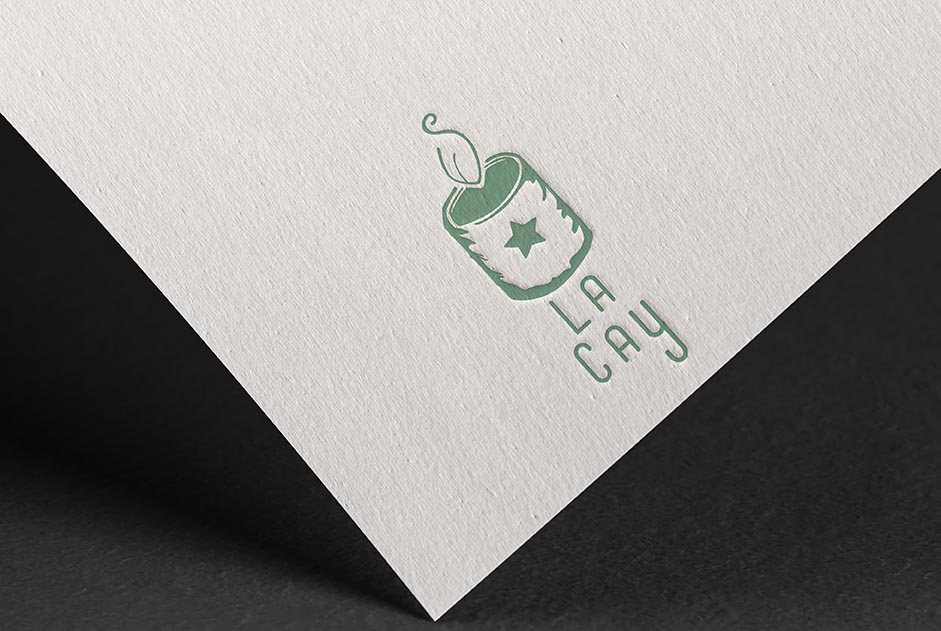
For my Branding Course at Emily Carr University; I was assigned a family-owned Vietnamese restaurant's brand to redesign into a more modern style. Vietnamese Tea House was it's original name. I delve deep into my research about the restaurant's history, its location, the history of the neighborhood and the market - La Cay was my solution to bring the restaurant into the spotlight of East Hasting, Vancouver. The idea was to focus on the healthy, casual-fast food that Vietnamese cuisine could provide for a city where everyone was always on the move.
Social Media Design
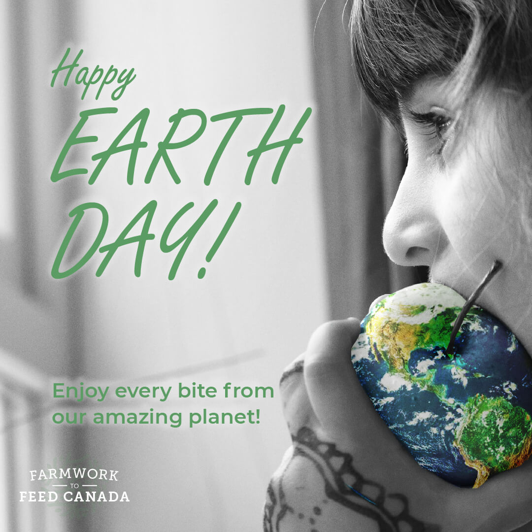
A blink-of-an-eye is all the time you have to grab someone's attention. That is why creating social media graphics is a challenge in both communication and psychology. Grabbing attention requires you to design a way to prevent being filtered out as irrelevant information. Leveraging visual design techniques that not only visually register well with the user, but also delivers your message in a small concentrated package is my inspiration for Social Media Design. In my examples below, I use layouts, color, composition, and typography to generate eye-catching designs. The visual language behind the designs seeks to tell the story before the text is even read. Thereby, giving more than just a blin-of-the-eye to make a memorable impression on your audience.
Date: August 2020
Type: Digital Design
Role: Graphic Designer